
5.2 Working with cards


Part of the Agile Project Management manual — see also 1. Introduction, 2. What's New, 3. Scope, 4.1 General setup, 4.2 Labels, 4.3 Project task templates and checklists, 4.4 Notifications, 5.1 The board, 5.3 Project task cards, 5.4 Ticket cards, 5.5 Labels, 6. Troubleshooting.
5.2.1 Task cards and ticket cards
The board shows two kinds of card. Task cards are the project's tasks and are edited on the board. Ticket cards are tickets linked to the project, or to one of its tasks, and are mostly edited in GLPI's own ticket form.
5.2.1.1 Task icon
A teal checklist icon in the card's top row marks the card as a project task, as opposed to a ticket. It is the same icon GLPI uses for project tasks elsewhere, so a card is identifiable as a task without reading anything else on it. Ticket cards show their own icon in this position instead — see the next step.
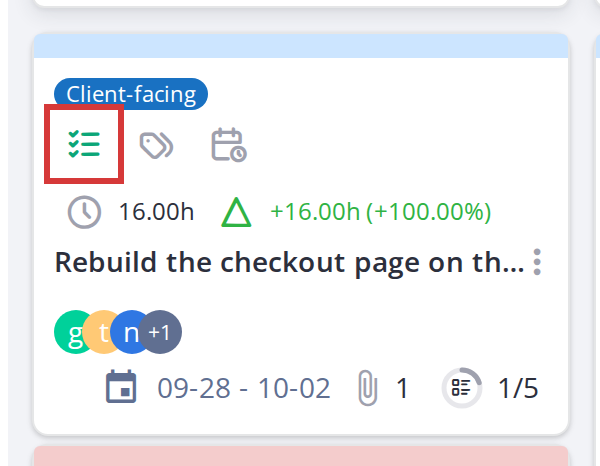
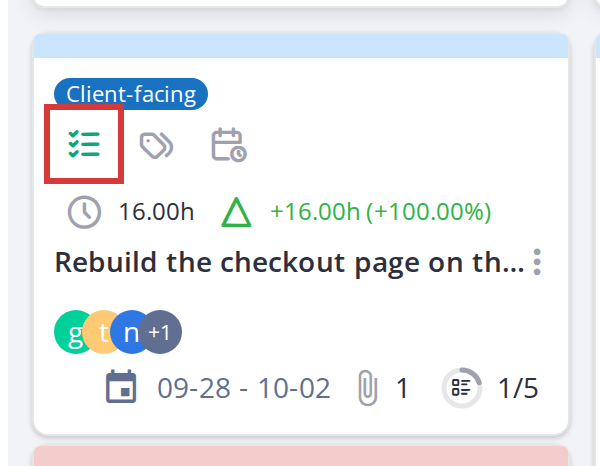
The teal task icon distinguishes a task card from a ticket card
5.2.1.2 Ticket type icon
A red exclamation circle (⚠) indicates an Incident ticket; a blue question mark (?) indicates a Request. These appear at the top of ticket cards.
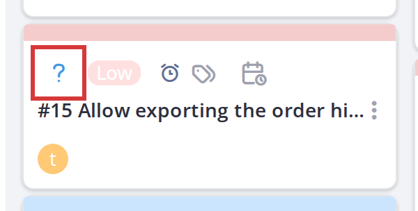
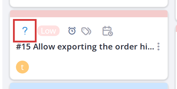
Note: Task cards and ticket cards are colour-coded by background: the task background colour (configured in Setup > General options) for tasks, and the ticket background colour for tickets. This makes them easy to tell apart at a glance.
5.2.2 Card detail modal
Click any card to open its detail panel. In modal mode (the default), the panel is a popup window; in docked mode, it opens in a sidebar on the right. Either way, the form and available actions are the same.
5.2.2.1 Open a card
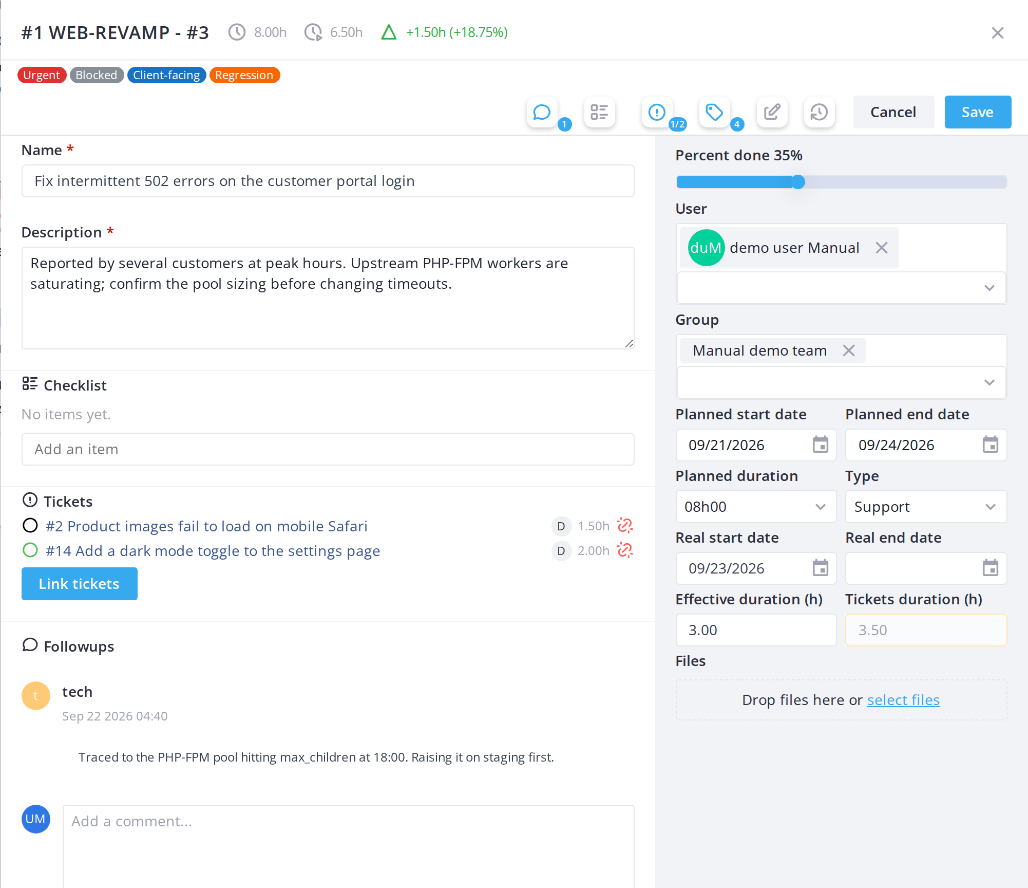
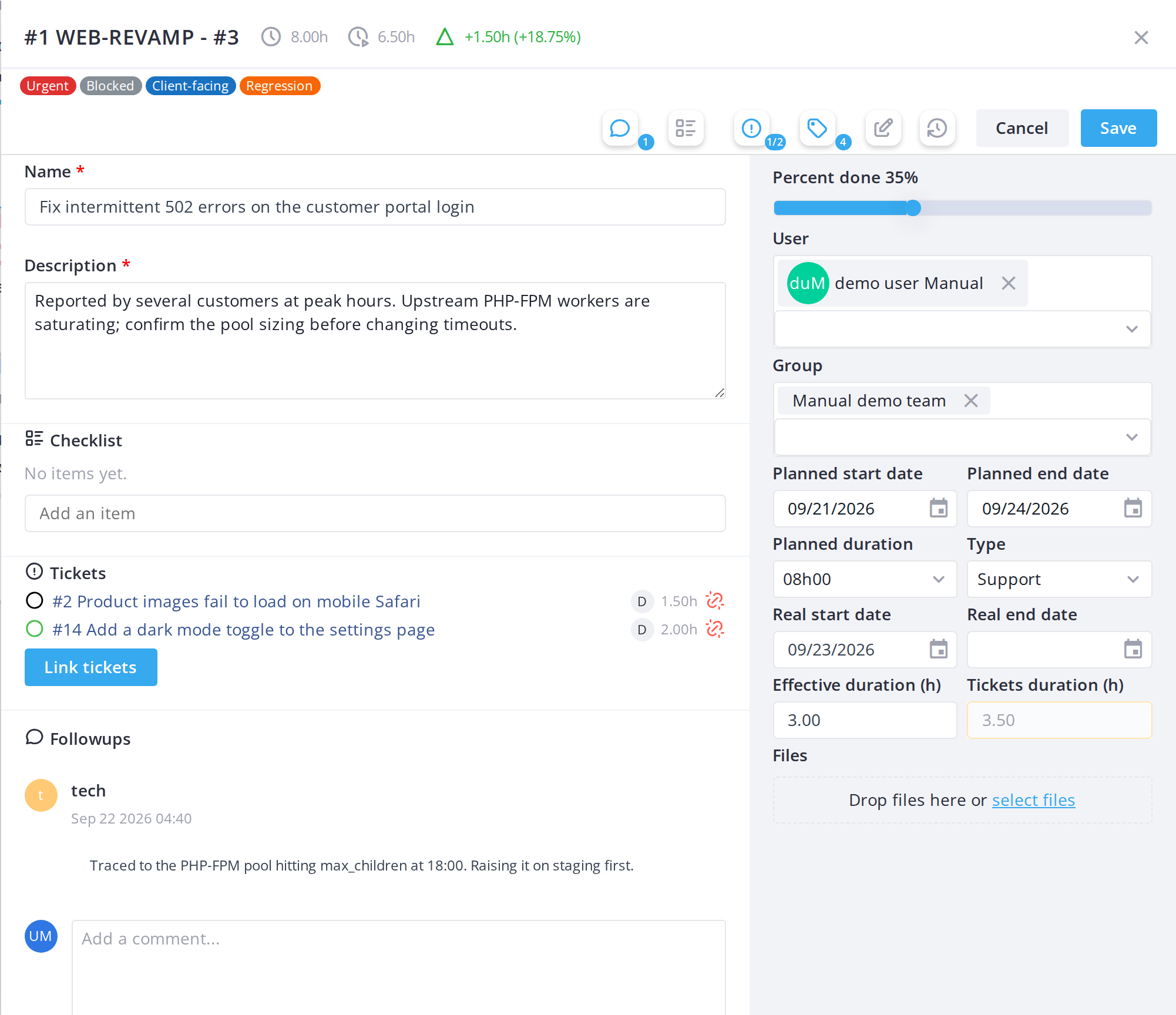
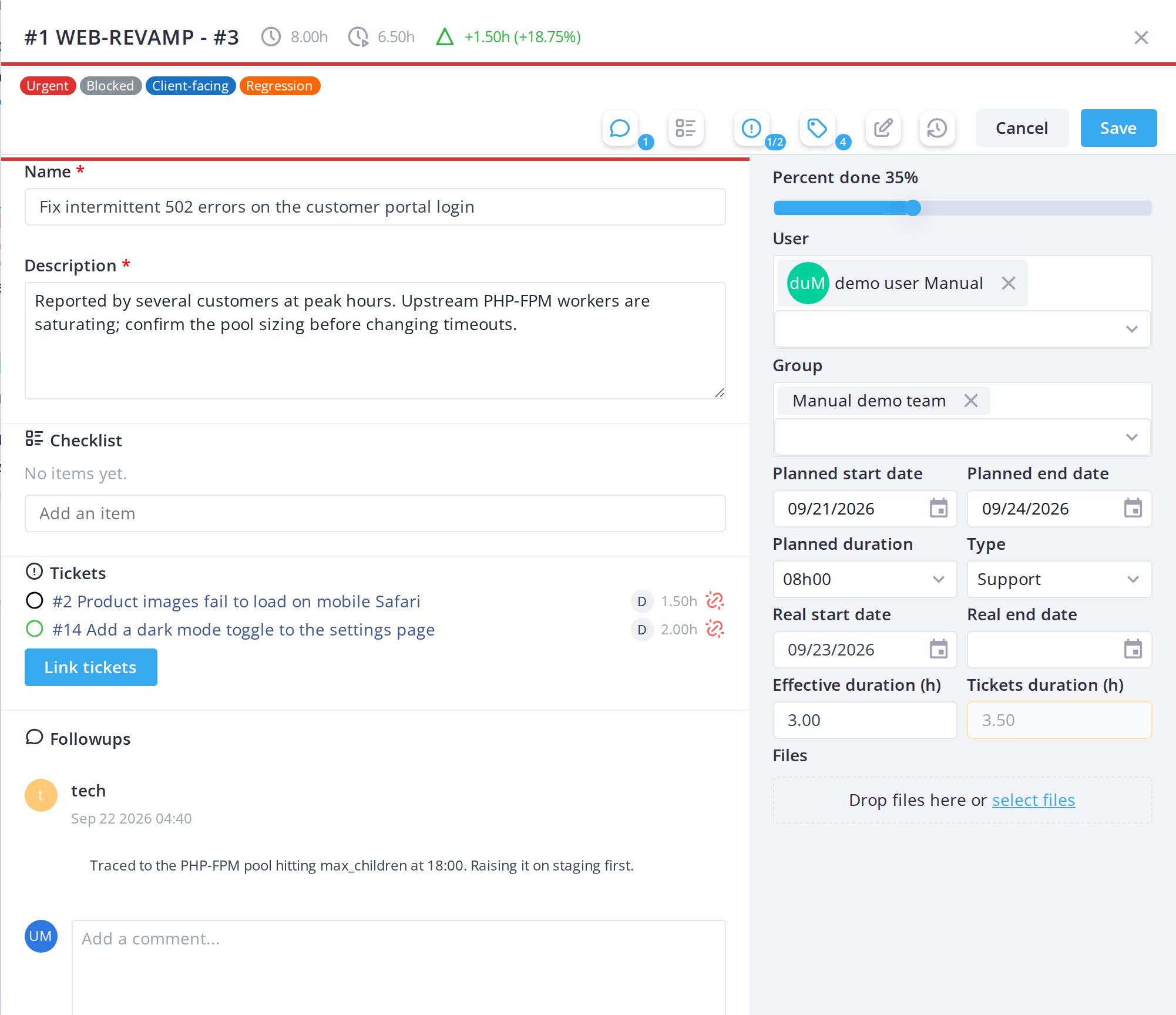
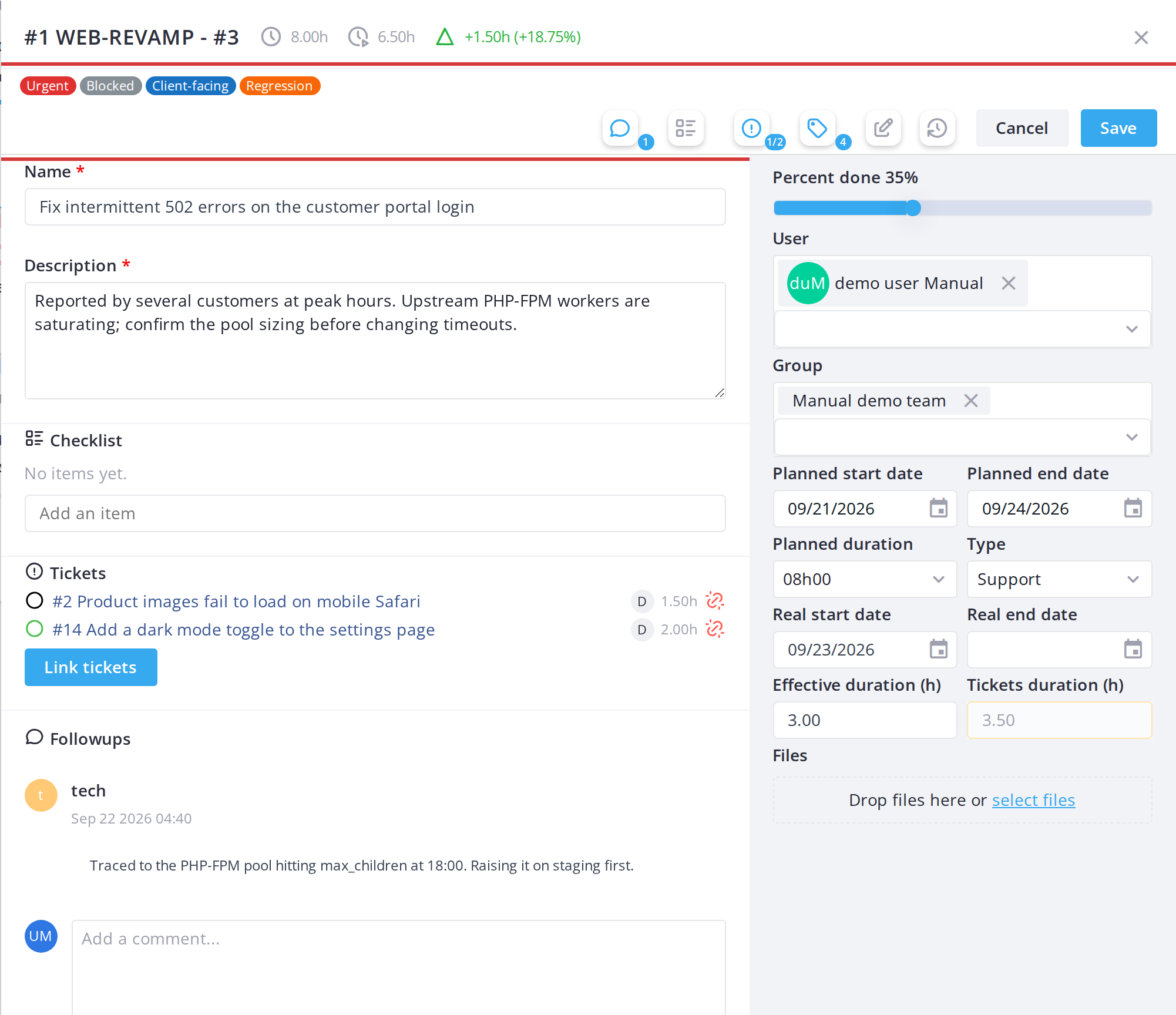
Click a card on the board. Its detail modal opens, showing the card's title, description, assigned user(s), dates, type, status, comments and attachments.
5.2.2.2 Buttons and counters in the window
- Grey, no counter: the section is empty.
- Orange: the section has content but is hidden.
- Blue: the section is shown.
The Historical button opens the task or ticket in GLPI on its Historical tab, in a new browser tab. Every board action is recorded there, including checklist changes and team members added from the board; for a task, the effective duration shown is the one the board keeps. The button is shown only to users allowed to see the Historical tab.


5.2.2.3 Close the modal
Click Cancel at the bottom right of the modal (or the X button in the title bar) to close it without saving.
Note: Fields you can't edit are greyed out and locked, with a tooltip saying why. Modal editing is the default view. You can switch to docked editing (sidebar on the right) using the pin icon in the toolbar, which you may prefer for larger screens.
5.2.3 Followups
5.2.3.1 Add a followup, or hide the followups
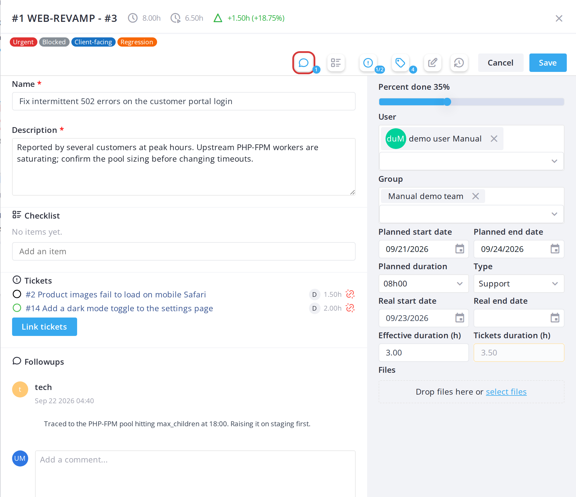
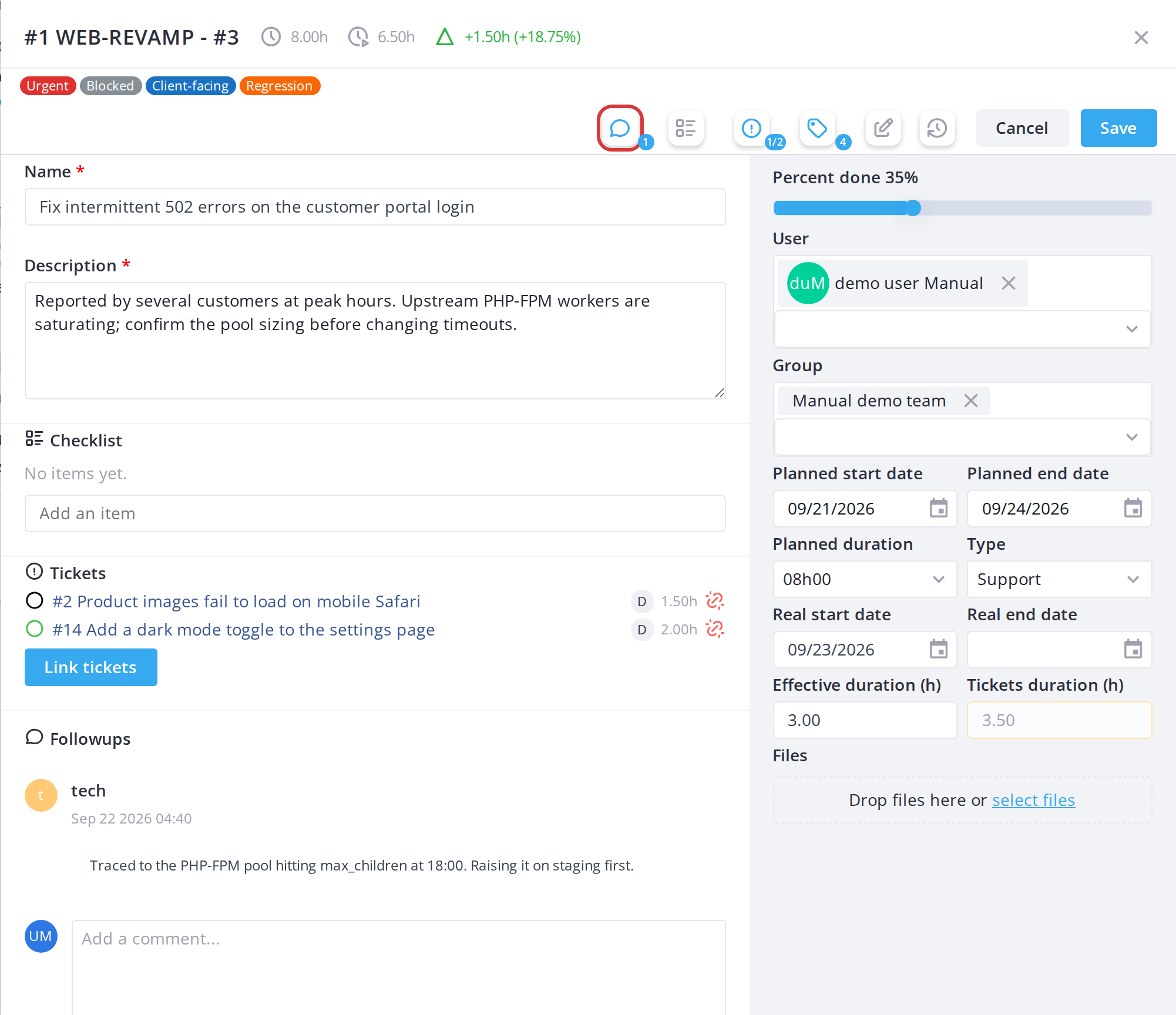
The Followups section at the bottom of the card window lists the card's comments. Type a new one in the text box and click Send. For a ticket card it becomes a followup of the ticket. The followups button in the window's button bar shows how many there are and hides or shows the section, which keeps a long discussion out of the way while you edit the card; the choice is remembered. A new comment triggers the New Comment notification.
5.2.4 Saving card changes
5.2.4.1 Save changes
Click Save at the bottom right of the modal to save your changes and close the modal.
5.2.4.2 Discard changes
Click Cancel to close the modal without saving.
Note: The modal requires a title (name) for any new card. If you save without one, the form will highlight the missing field in red and prevent saving.
5.2.5 Icons shared by both kinds of card
These icons appear on task and ticket cards alike. Hover any of them for a tooltip.
5.2.5.1 Assigned user avatars
Small circular avatars along the bottom of the card show who the task is assigned to. A user with a profile picture is shown as that picture; a user without one is shown as their coloured initials, so people are still tellable apart. Avatars overlap to save space, and where more are assigned than fit, the last circle reads +N for the rest. Hover over any avatar for the full name.
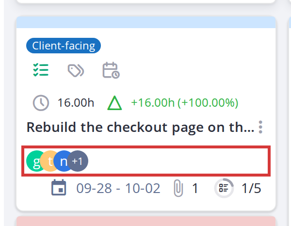
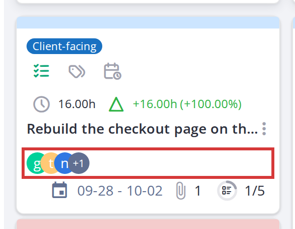
Assigned users, shown as pictures or coloured initials
5.2.5.2 Assigned group avatars
A group assigned to the task appears in the same row as the users, as a purple circle with a group icon rather than a picture or initials — so a group is never mistaken for a person. Hover over it for the group name. Groups are assigned from the card's editor, not from the card face.
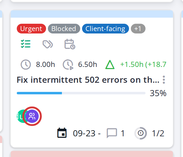
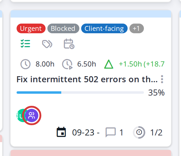
A group assigned to a task, alongside the assigned users
5.2.5.3 Comments icon
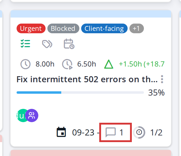
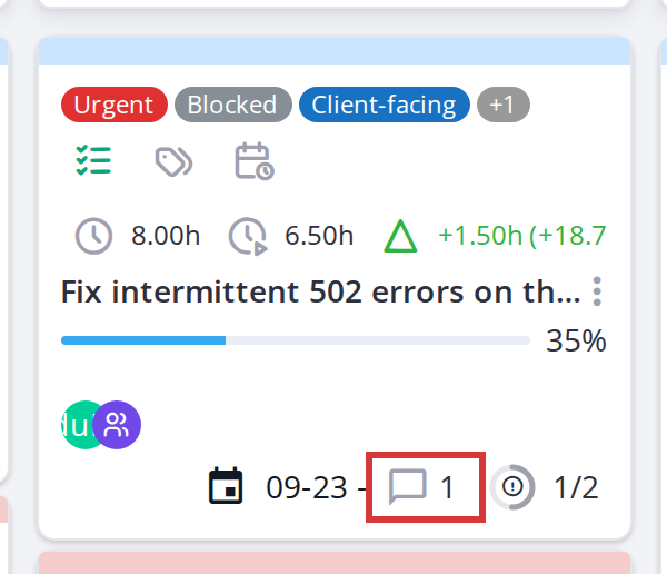
A comment bubble icon shows how many comments are on the card. Click it (if the modal is open) to scroll to the comments section.
5.2.5.4 Label chips
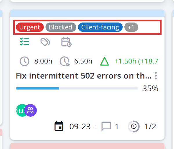
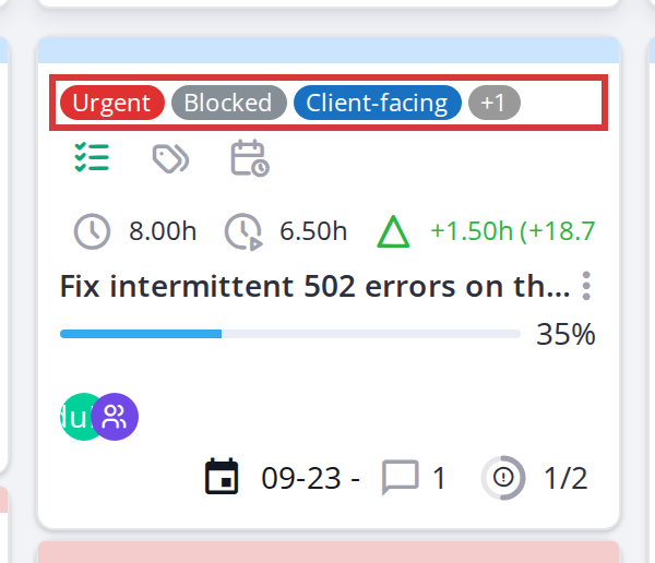
Colored chips on a card show labels assigned to it. Hover over a chip to see the full label name. If a card has many labels, extra ones collapse into a "+N" badge.
Generated for Agile Project Management 2.2.0-beta.1 on GLPI 11.0 — 2026-09-27.