
5.2 Working with cards


Part of the Agile Project Management manual — see also 1. Introduction, 2. What's New, 3. Scope, 4.1 General setup, 4.2 Labels, 4.3 Project task templates and notificationschecklists, 4.4 Notifications, 5.1 The board, 5.3 Project task cards, 5.4 Ticket cards, 5.5 Labels and checklists, 6. Troubleshooting.
5.2.1 EditingTask cards, commentscards and attachmentsticket cards
The board shows two kinds of card. Task cards are the project's tasks and are edited on the board. Ticket cards are tickets linked to the project, or to one of its tasks, and are mostly edited in GLPI's own ticket form.
5.2.1.1 EditTask icon
A teal checklist icon in the titlecard's ortop descriptionrow
Openmarks the card as a project task, as opposed to a ticket. It is the same icon GLPI uses for project tasks elsewhere, so a card is identifiable as a task without reading anything else on it. Ticket cards show their own icon in this position instead — see the next step.
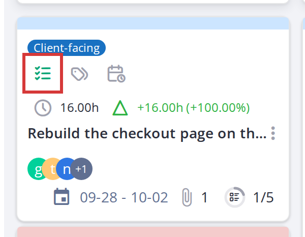
The teal task icon distinguishes a task card from a ticket card
5.2.1.2 Ticket type icon
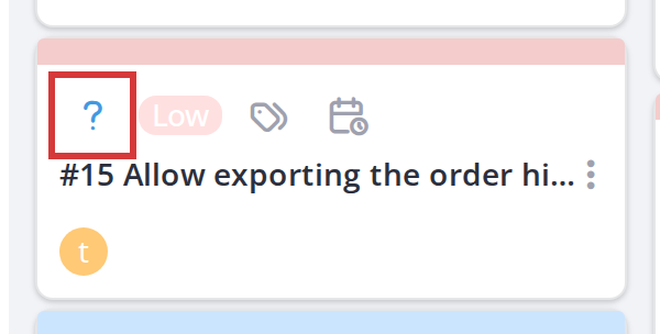
A red exclamation circle (⚠) indicates an Incident ticket; a blue question mark (?) indicates a Request. These appear at the top of ticket cards.
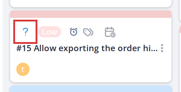
Note: Task cards and
clickticket cards are colour-coded by background: the task background colour (configured in Setup > General options) for tasks, and the ticket background colour for tickets. This makes them easy to tell apart at a glance.
5.2.2 Card detail modal
Click any card to open its titledetail orpanel. descriptionIn tomodal editmode it(the indefault), place.the Eachpanel is a separatepopup rightwindow; (in docked mode, it opens in a sidebar on the right. Either way, the form and available actions are the same.
5.2.2.1 Open a card
Click a card on the board. Its detail modal opens, showing the card's title, description, assigned user(s), dates, type, status, comments and attachments.
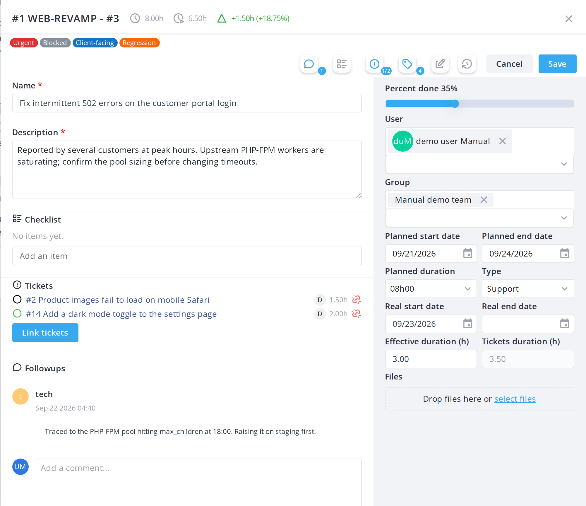
5.2.2.2 Buttons and counters in the window
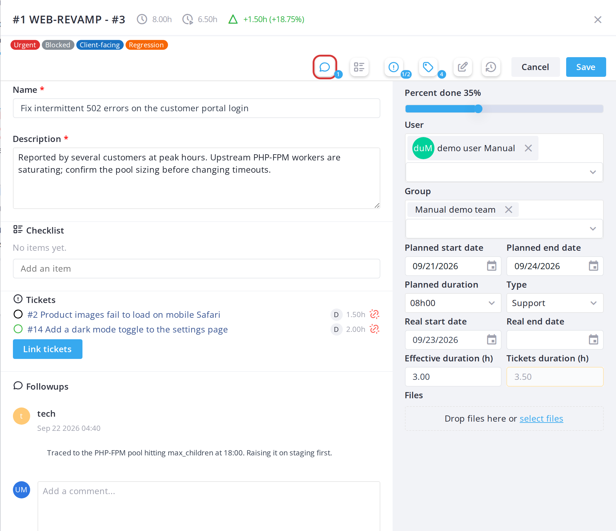
The SaveHistorical button opens the task or ticket in GLPI on its Historical tab, in a new browser tab. Every board action is recorded there, including checklist changes and team members added from the board; for a task, the effective duration shown is the one the board keeps. The button is shown only to users allowed to see the Historical tab.
5.2.2.3 Close the modal
Click Cancel at the bottom right of the modal.modal (or the X button in the title bar) to close it without saving.
Note: Fields you can't edit are greyed out and locked, with a tooltip saying why. Modal editing is the default view. You can switch to docked editing (sidebar on the right) using the pin icon in the toolbar, which you may prefer for larger screens.
5.2.3 Followups
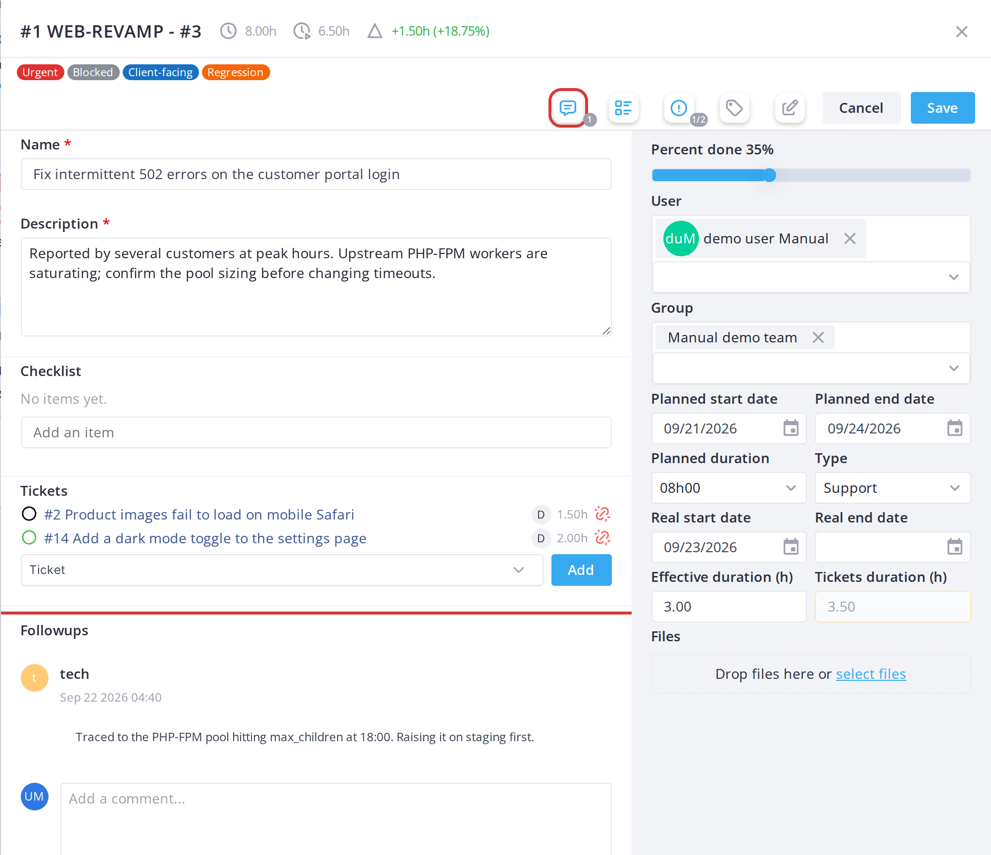
5.2.1.23.1 Add a followup, or hide the followups
The Followups section at the bottom of the card window lists the card's comments. Type a new one in the text box and click Send. For a ticket card it becomes a followup of the ticket. The followups button in the window's button bar shows how many there are and hides or shows the section, which keeps a long discussion out of the way while you edit the card; the choice is remembered. A new comment triggers the New Comment notification.
5.2.4 Saving card changes
5.2.4.1 Save changes
Click Save at the bottom right of the modal to save your changes and close the modal.
5.2.1.34.2 AddDiscard a private comment (tickets only)changes
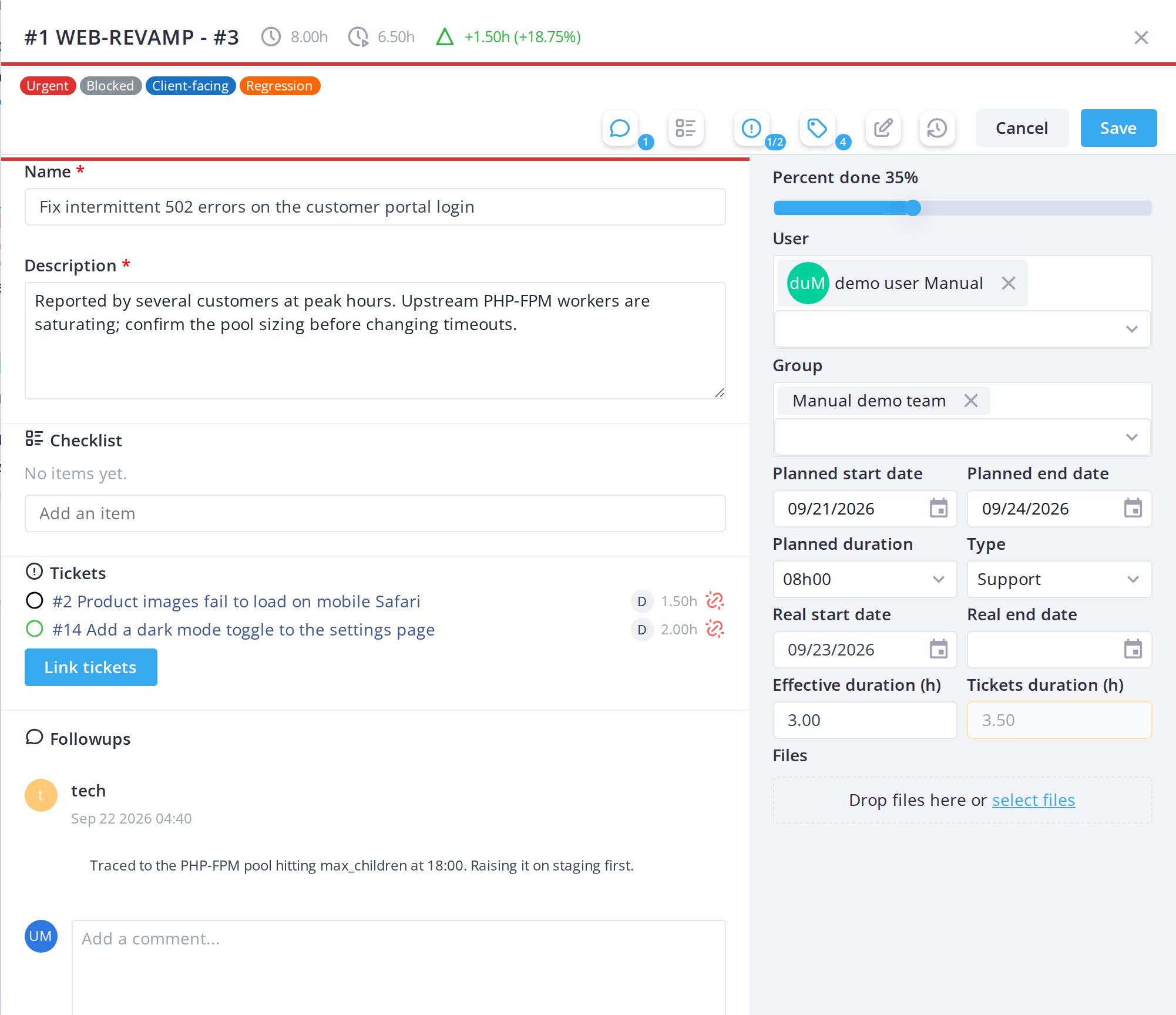
WhenClick commenting on a ticket, you can mark a comment as private (visible onlyCancel to you and managers) by clickingclose the lockmodal iconwithout checkbox before sending.
5.2.1.4 Attach a file
In the Files section of the modal, click the upload area or drag and drop a file to attach it to the card. Files attached to a card trigger the New Attachment notification and become regular GLPI documents linked to the underlying project task.saving.
Note:
DeletingThe modal requires acardtitle (thename)Deleteforaanycardnewright)card.removesIf you save without one, theunderlyingformprojectwilltask or un-linkshighlight theticketmissing—fieldainticketredcard'sandticketpreventitself is never deleted, only removed from the board.saving.
5.2.25 UnderstandingIcons shared by both kinds of card
These icons andappear content
A card displays several pieces of information at a glance: title, assigned users, type, duration, dates and status. Icons represent different aspects of the card — hover over them to see tooltips.
5.2.2.1 Task card layout
A projecton task card shows:
5.2.2.2 Ticket card layout
A linked ticket card shows similar information to a task card, plus:
Note:Task cardsand ticket cardsarealike.colour-codedHoverbyanybackground:ofthe task background colour (configured in Setup > General options)them fortasks, and the ticket background colour for tickets. This makes them easy to tell apart ataglance.
5.2.3 Deleted task cards
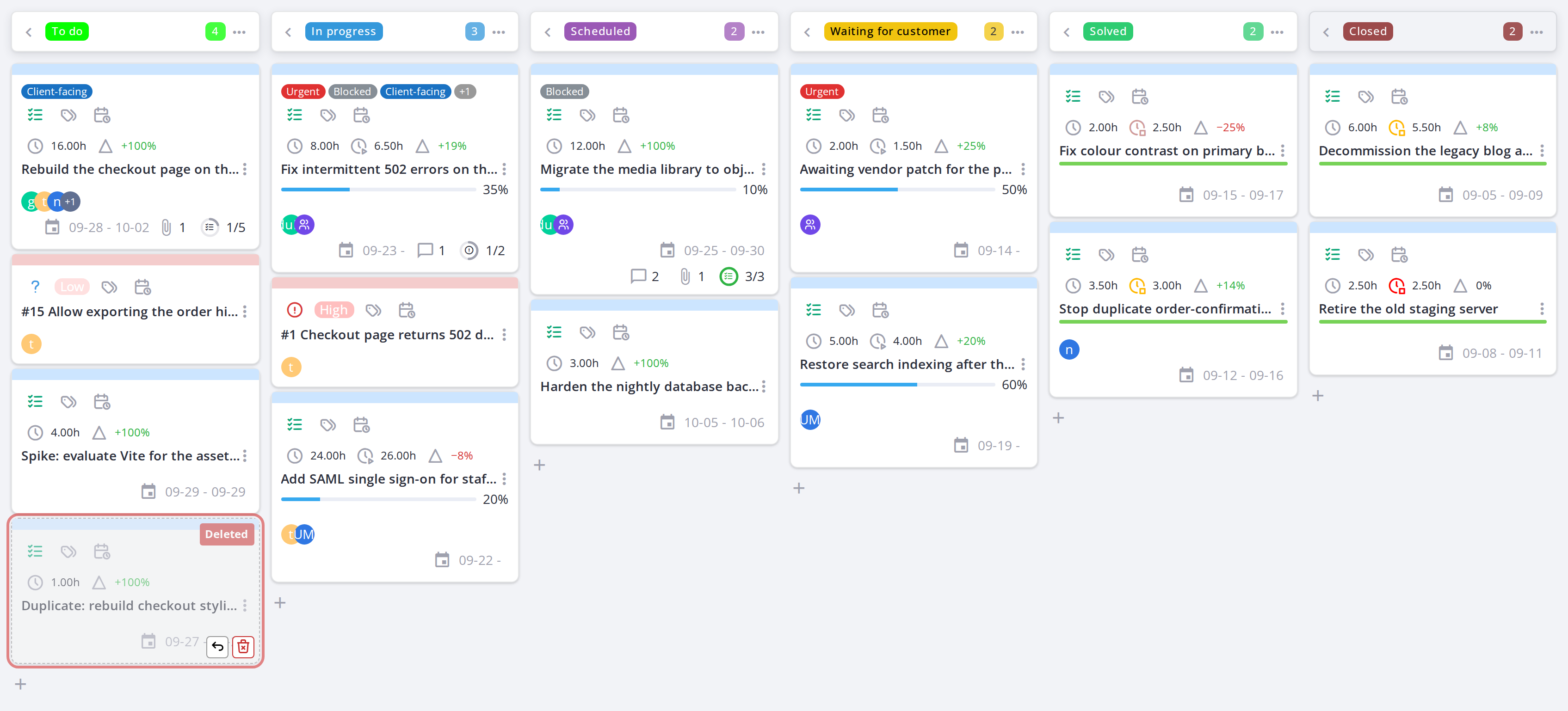
When a task is deleted, its card remains on the board (grayed out) until it is purged. You can restore or purge deleted tasks.tooltip.
5.2.3.5.1 Show deleted tasks
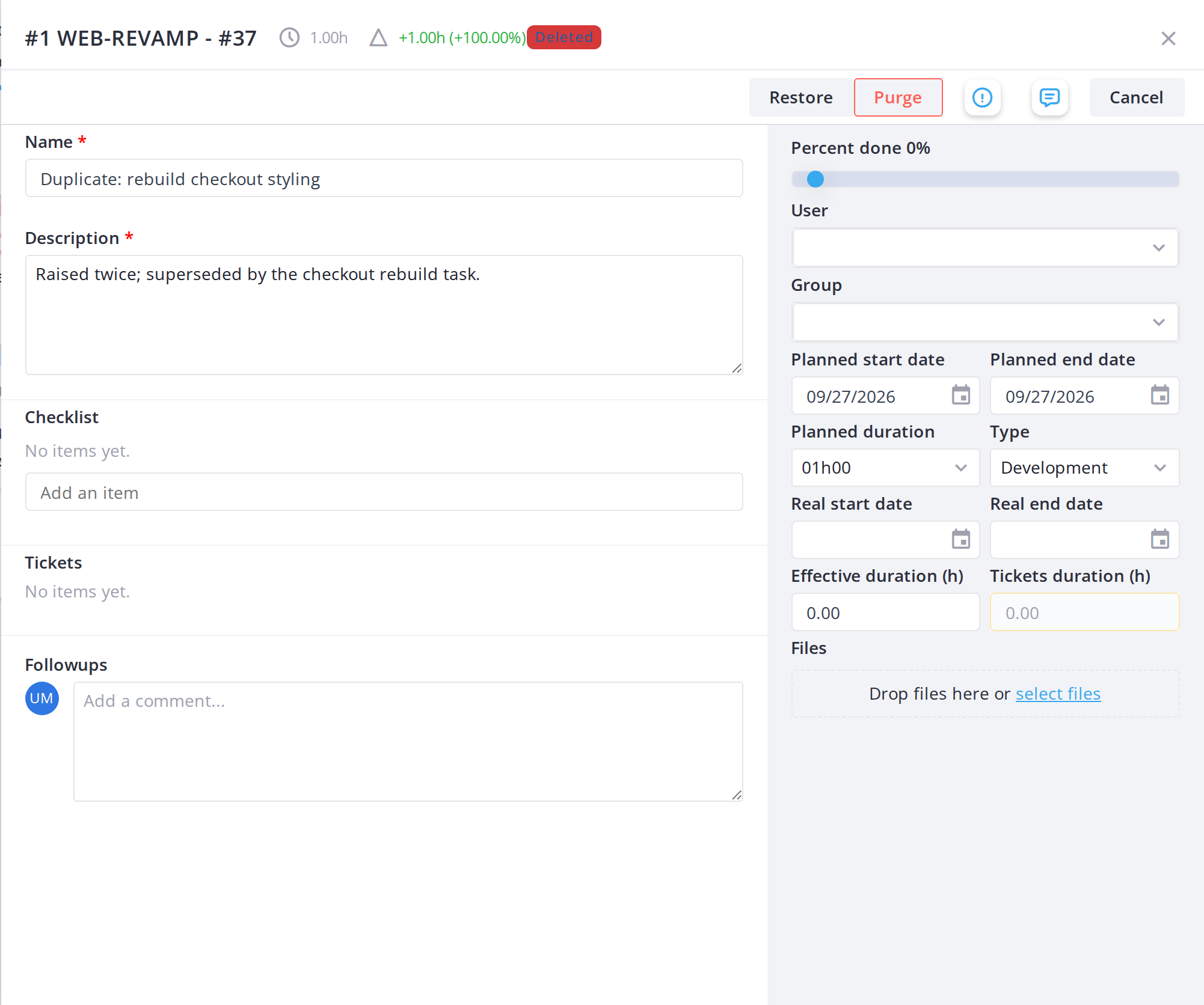
By default, deleted task cards are hidden. Click the trash icon in the toolbar to show them. Deleted cards appear faded with a "Deleted" label.
5.2.3.2 Restore a deleted task
Open a deleted task card and click Restore in the action bar. The task is restored and becomes fully editable again. You must have the Restore a card right.
5.2.3.3 Permanently delete (purge) a task
Open a deleted task card and click Purge in the action bar. The task is permanently deleted and cannot be restored. You must have the Permanently delete a card right.
Note:Restoring and purging require their own rights (Restore a cardandPermanently delete a card). Without them, deleted cards cannot be acted on.
5.2.4 Icon meanings and tooltips
Every icon on a card carries a tooltip (shown on hover) that explains what it means. Here's a complete reference.
5.2.4.1 Task type icon
A tag icon shows the task's type — Development, Support, New Feature or Spike in this example. The icon and label are taken from the task type configured in Setup. Hover over it to see the full type name. (Ticket cards show their ticket type — Incident or Request — in a different location, not as a badge.)
5.2.4.2 Duration icon
A clock icon appears next to the type badge if a duration is set. Hover over it to see how long the task is estimated to take, in days or hours.
5.2.4.3 Creation date icon
A calendar icon shows the date the card was created. Hover over it to see the exact date and time, or if the card has planned start and end dates.
5.2.4.4 Priority badge (tickets only)
Ticket cards show a colored priority badge (low, medium, high, very high). The color intensity increases with priority. Task cards do not show priority.
5.2.4.5 Task icon (task cards only)
A teal checklist icon in the card's top row marks the card as a project task, as opposed to a ticket. It is the same icon GLPI uses for project tasks elsewhere, so a card is identifiable as a task without reading anything else on it. Ticket cards show their own icon in this position instead — see the next step.
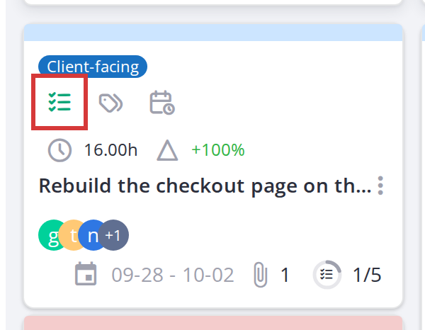
The teal task icon distinguishes a task card from a ticket card
5.2.4.6 Ticket type icon (tickets only)
A red exclamation circle (⚠) indicates an Incident ticket; a blue question mark (?) indicates a Request. These appear at the top of ticket cards.
5.2.4.7 Assigned user avatars
Small circular avatars along the bottom of the card show who the task is assigned to. A user with a profile picture is shown as that picture; a user without one is shown as their coloured initials, so people are still tellable apart. Avatars overlap to save space, and where more are assigned than fit, the last circle reads +N for the rest. Hover over any avatar for the full name.
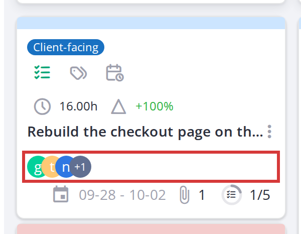
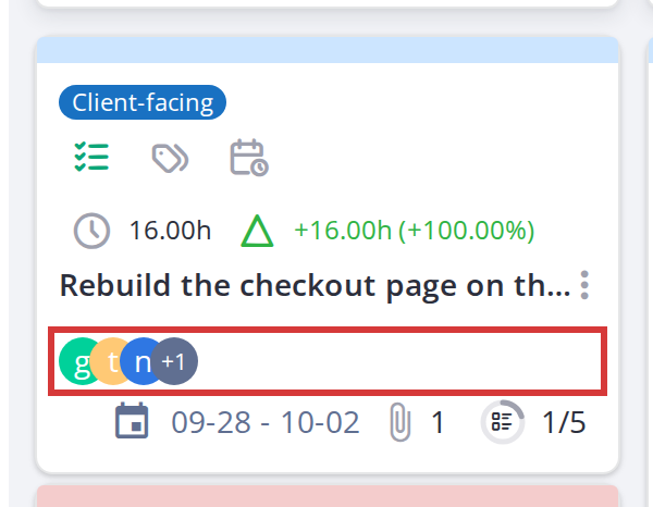
Assigned users, shown as pictures or coloured initials
5.2.4.85.2 Assigned group avatars
A group assigned to the task appears in the same row as the users, as a purple circle with a group icon rather than a picture or initials — so a group is never mistaken for a person. Hover over it for the group name. Groups are assigned from the card's editor, not from the card face.
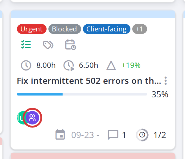
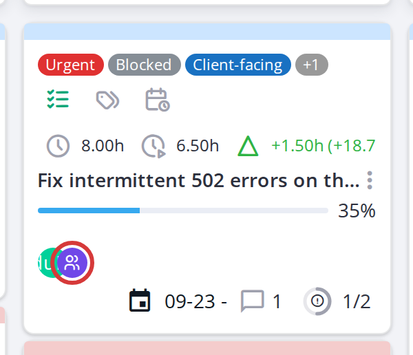
A group assigned to a task, alongside the assigned users
5.2.4.9 Progress bar
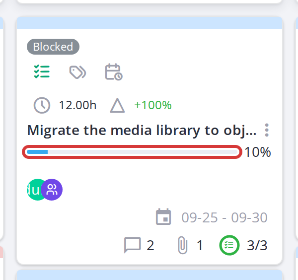
A colored bar shows how much of the task is complete (percent done, 0–100%). When a task is 100% complete, the bar turns green and the percentage is hidden.
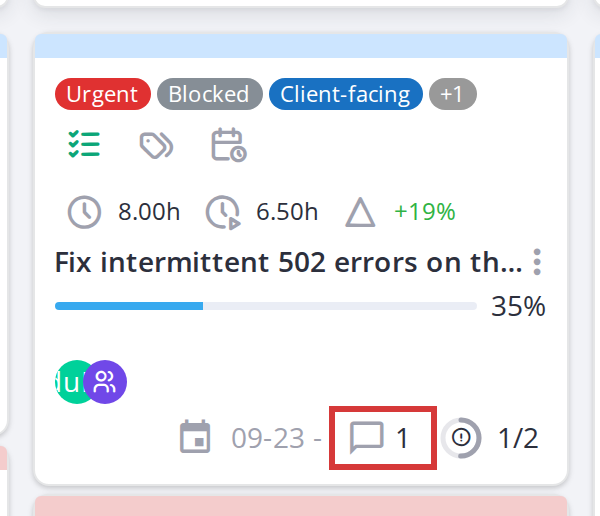
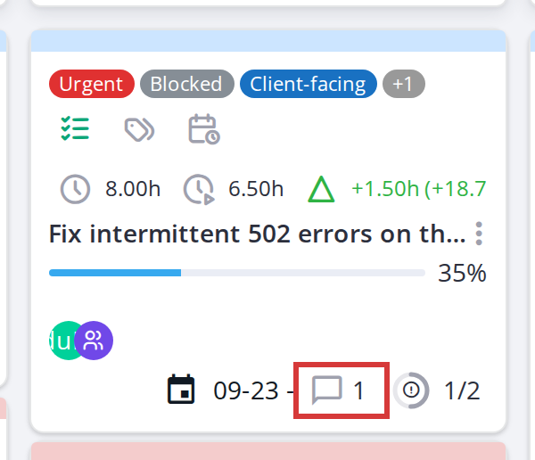
5.2.4.103 Comments icon
A comment bubble icon shows how many comments are on the card. Click it (if the modal is open) to scroll to the comments section.
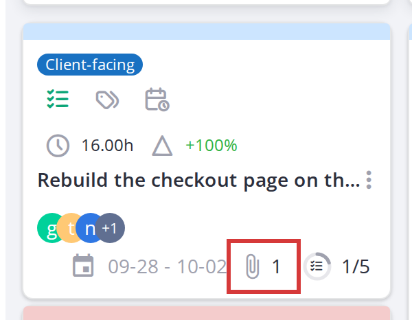
5.2.4.11 Attachments icon
A paperclip icon shows how many files are attached to the card. Click it (if the modal is open) to jump to the attachments section.
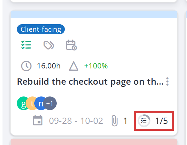
5.2.4.12 Checklist icon (task cards only)
A checkmark icon indicates the card has a checklist. Click it (if the modal is open) to show/hide the checklist panel.
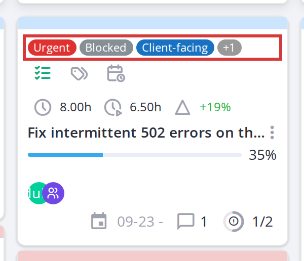
5.2.4.134 Label chips
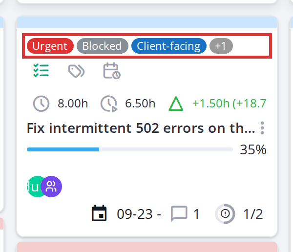
Colored chips on a card show labels assigned to it. Hover over a chip to see the full label name. If a card has many labels, extra ones collapse into a "+N" badge.
5.2.4.14 Ticket linked to task indicator (tickets only)
When a ticket is linked to a project task, a small copy icon appears next to the creation date. Hover over it to see which task it is linked to. The entire ticket card also gets a dashed border in the task background colour.
5.2.4.15 Ticket count icon (task cards only)
When "Show tickets linked to a task" is toggled on, a badge at the bottom of a task card shows how many tickets are linked to it (e.g., "3"). Click it to see which tickets they are.
5.2.5 Task cards vs ticket cards
Task cards (project tasks) and ticket cards (linked tickets) look similar on the board but behave differently in the detail modal.
5.2.5.1 Editing a task card
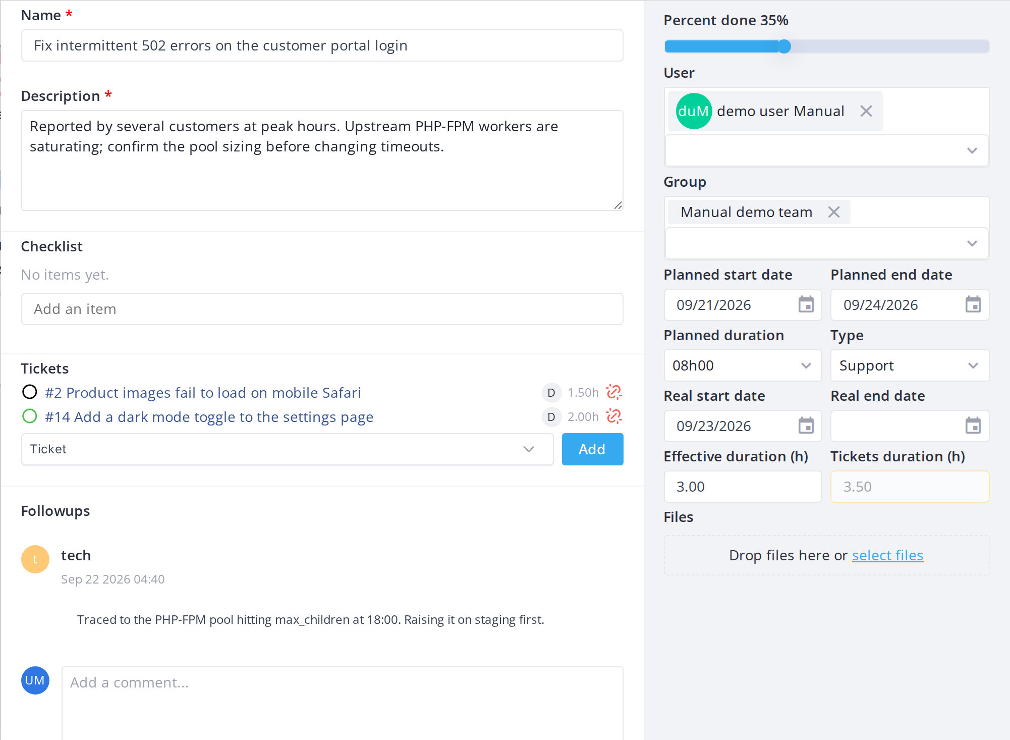
Task cards are fully editable — you can change the title, description, assigned users, dates, duration, type and all other fields (depending on your permissions). Edit any field by clicking on it and making your changes.
5.2.5.2 Viewing a ticket card
Ticket cards are mostly read-only. When you open a ticket, you can only view its type, category, requester, watcher and assigned-to information — you cannot change these from the Kanban board. You can still add comments, attach files and move the ticket between columns.
5.2.5.3 Unlink a ticket from its task
When a ticket card is linked to a task, its window has an Unlink button. It removes the ticket from the task only: the ticket stays linked to the project, so its card stays on the board, and the ticket itself is untouched. It needs the Delete a card and Link tickets to a task rights and the right to update the project. The same can be done from the task's own window (see Tickets linked to a task).
Note:To edit a ticket's actual details (type, category, etc.), open its full form in GLPI. The detail modal has a button to open the full form in a new tab.
5.2.6 Adding a card
A new card is always a project task — ticket cards appear on the board once a ticket is linked to the project, they cannot be created directly from the board.
5.2.6.1 Add a card to a column
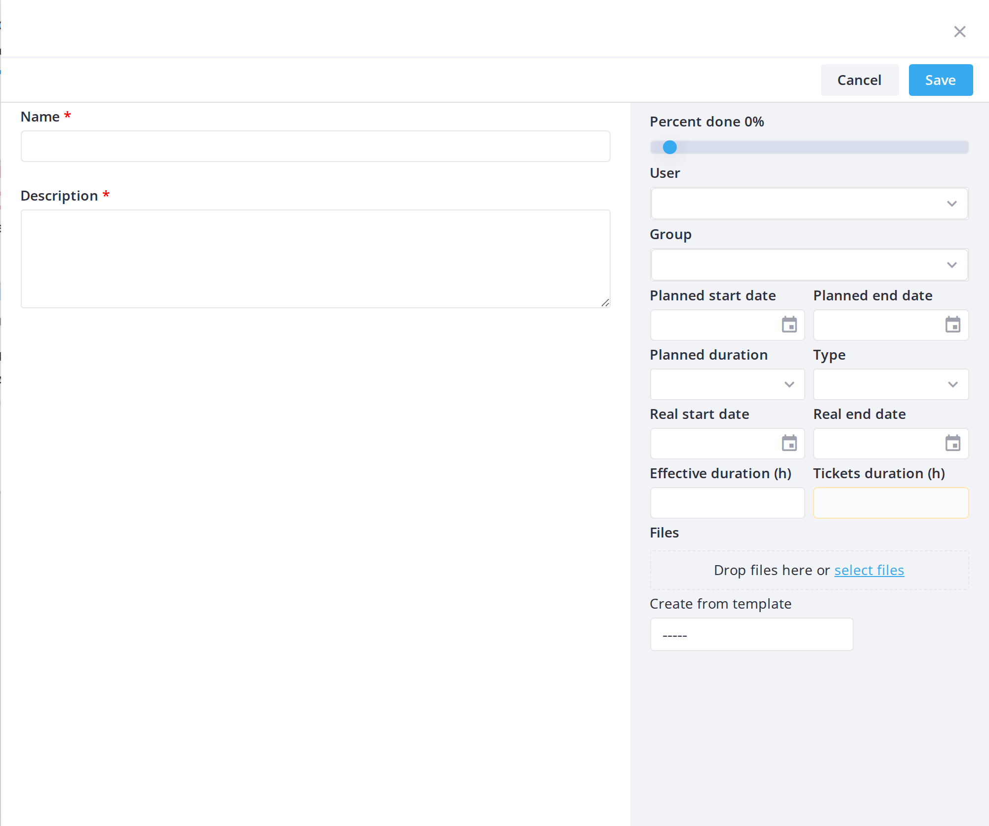
Click Add a card at the bottom of a column (or hover over the column header and select Add a card from the menu), give it a title, then fill in the detail panel that opens: description, assigned user(s) or group, start and end dates, planned duration, and type. The card is created directly in that column's project state.
5.2.6.2 Create from a template (optional)
When adding a new card, if task templates are available, use the Create from template dropdown to prefill the card with a template's fields. This is optional — you can create a blank card by leaving the dropdown empty.
Note:Adding a card requires theAdd a cardright.
5.2.7 Card form fields
The detail modal for a task card contains several fields for entering and editing information.
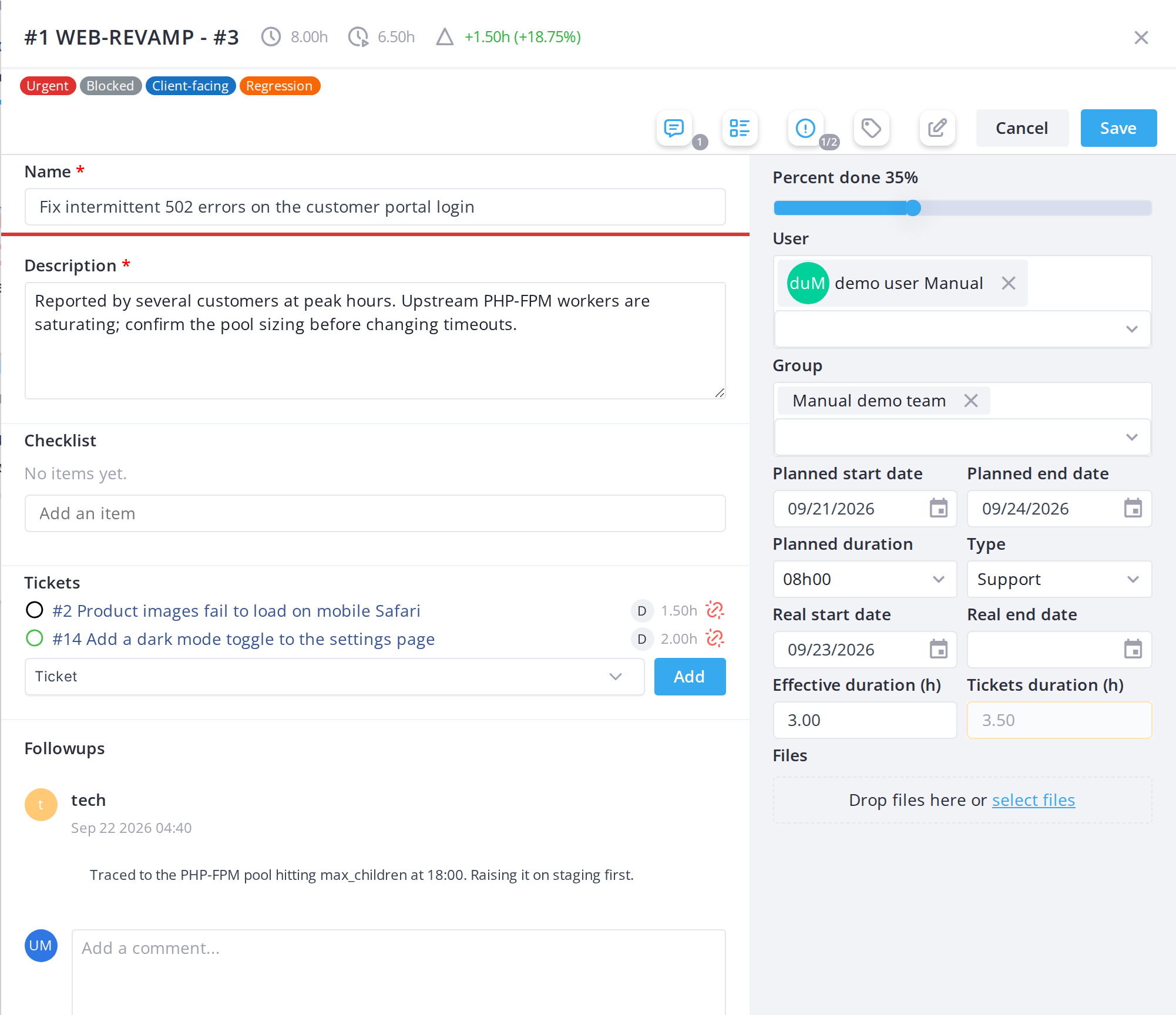
5.2.7.1 Edit the title
Open the card and click on the Name field to edit it. A red asterisk marks required fields.
5.2.7.2 Edit the description
Click the Description field to edit the card's description. Each is a separate right (Edit title, Edit description), so a profile can allow one without the other.
5.2.7.3 Assign a user
Use the User field in the card detail panel to add or remove team members. This is gated by the Assign user to a card right.
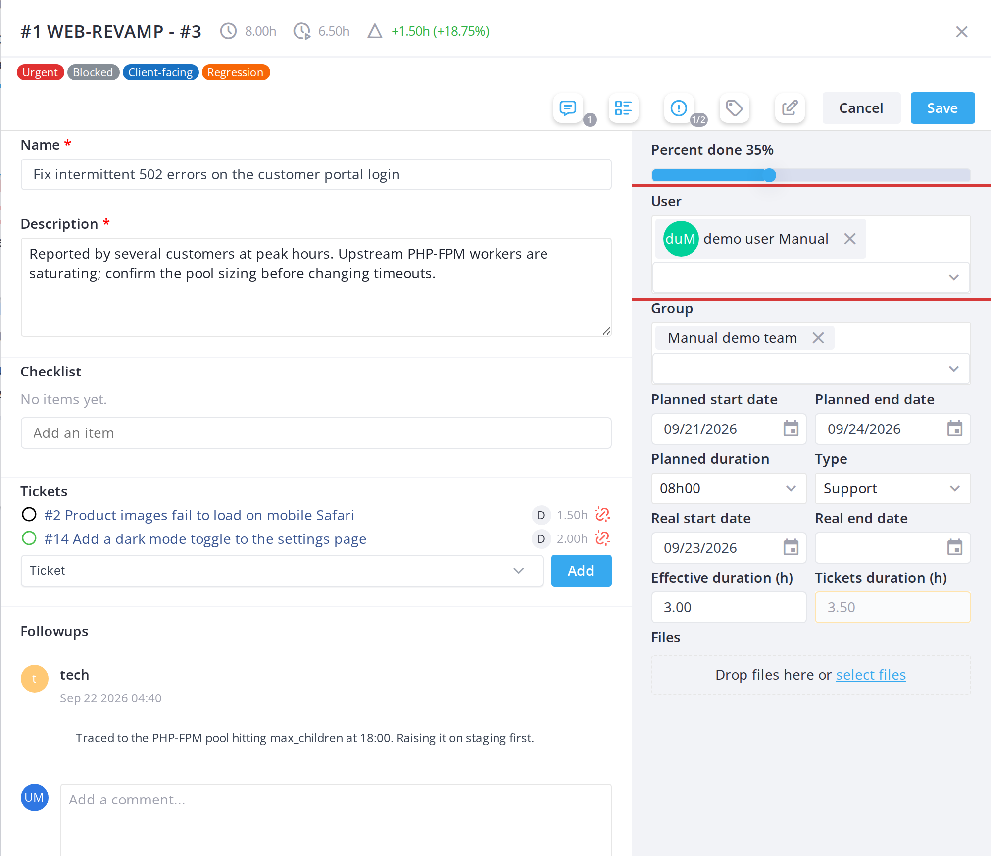
5.2.7.4 Set start and end dates
Use the Planned start date and Planned end date fields to set the card's timeline.
5.2.7.5 Set planned duration
Use the Planned duration dropdown to estimate how long the task will take.
5.2.7.6 Set the card type
Use the Type dropdown to categorize the task (e.g., Bug, Feature, Documentation). Available types are configured in Setup.
Note:Editing permissions are granular — each field is gated by its own right. A read-only field is grayed out and cannot be edited.
5.2.8 Card detail modal
Click any card to open its detail panel. In modal mode (the default), the panel is a popup window; in docked mode, it opens in a sidebar on the right. Either way, the form and available actions are the same.
5.2.8.1 Open a card
Click a card on the board. Its detail modal opens, showing the card's title, description, assigned user(s), dates, type, status, comments and attachments.
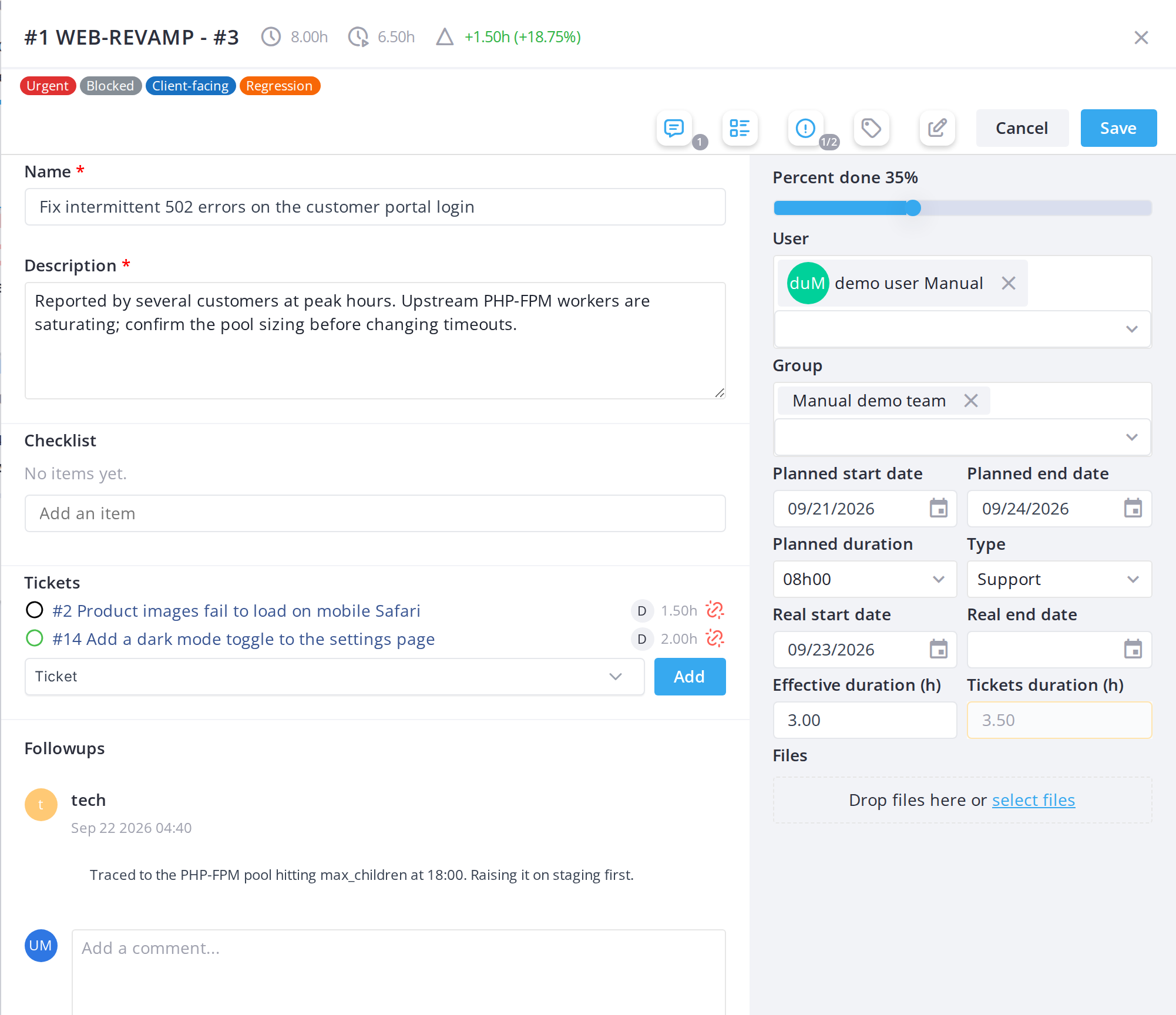
5.2.8.2 Close the modal
Click Cancel at the bottom right of the modal (or the X button in the title bar) to close it without saving.
Note:Modal editing is the default view. You can switch to docked editing (sidebar on the right) using the pin icon in the toolbar, which you may prefer for larger screens.
5.2.9 Saving card changes
5.2.9.1 Save changes
Click Save at the bottom right of the modal to save your changes and close the modal.
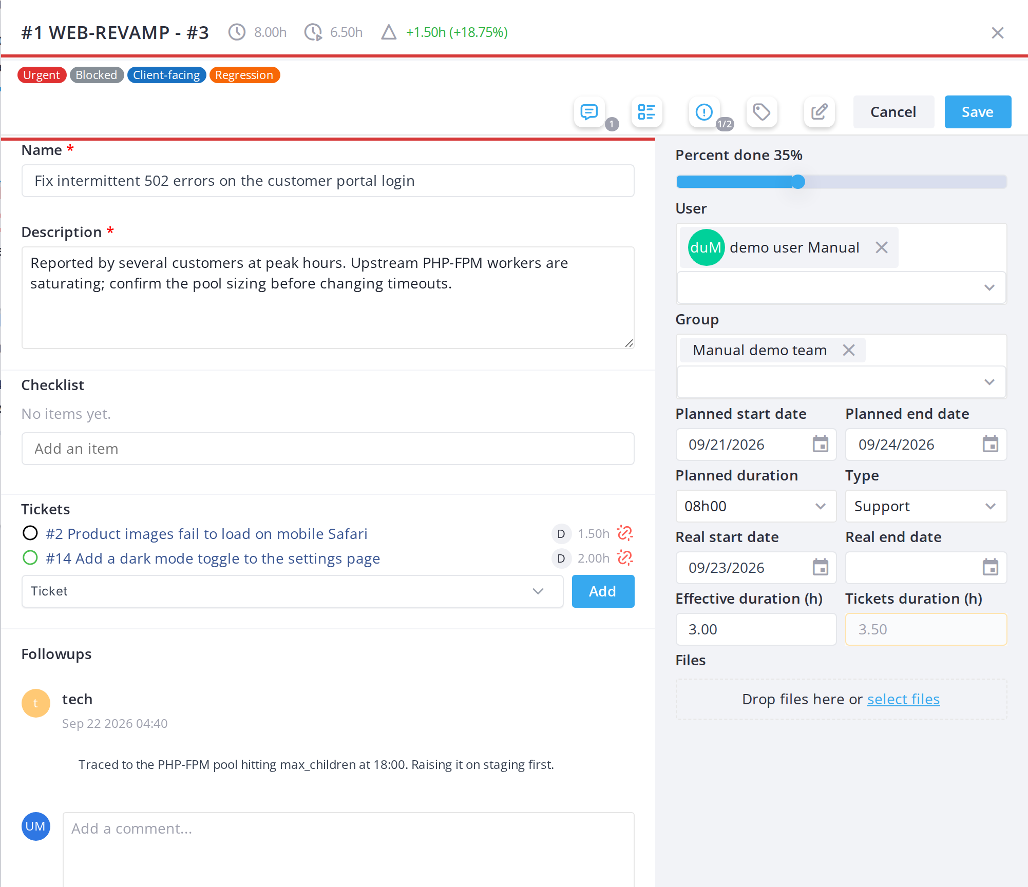
5.2.9.2 Discard changes
Click Cancel to close the modal without saving.
Note:The modal requires a title (name) for any new card. If you save without one, the form will highlight the missing field in red and prevent saving.
5.2.10 Time on a task: hours, real dates and late tasks
Each task card compares the time planned for the task with the time actually spent on it, and the board records when work on the task really started and ended. Both are kept up to date from the board itself, so the team does not have to fill them in.
5.2.10.1 Read the hours on a card
A task card with a planned duration shows three figures in its time row:
A task with no planned duration shows only the hours spent.
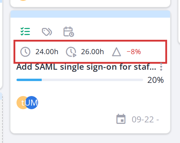
A task over its plan: 24 h planned, 26 h spent, 8 % over
5.2.10.2 Hours and real dates in the card window
The card window repeats the planned and spent hours next to the task number, with the time left or over in hours and percent, and shows the time fields in its side panel:
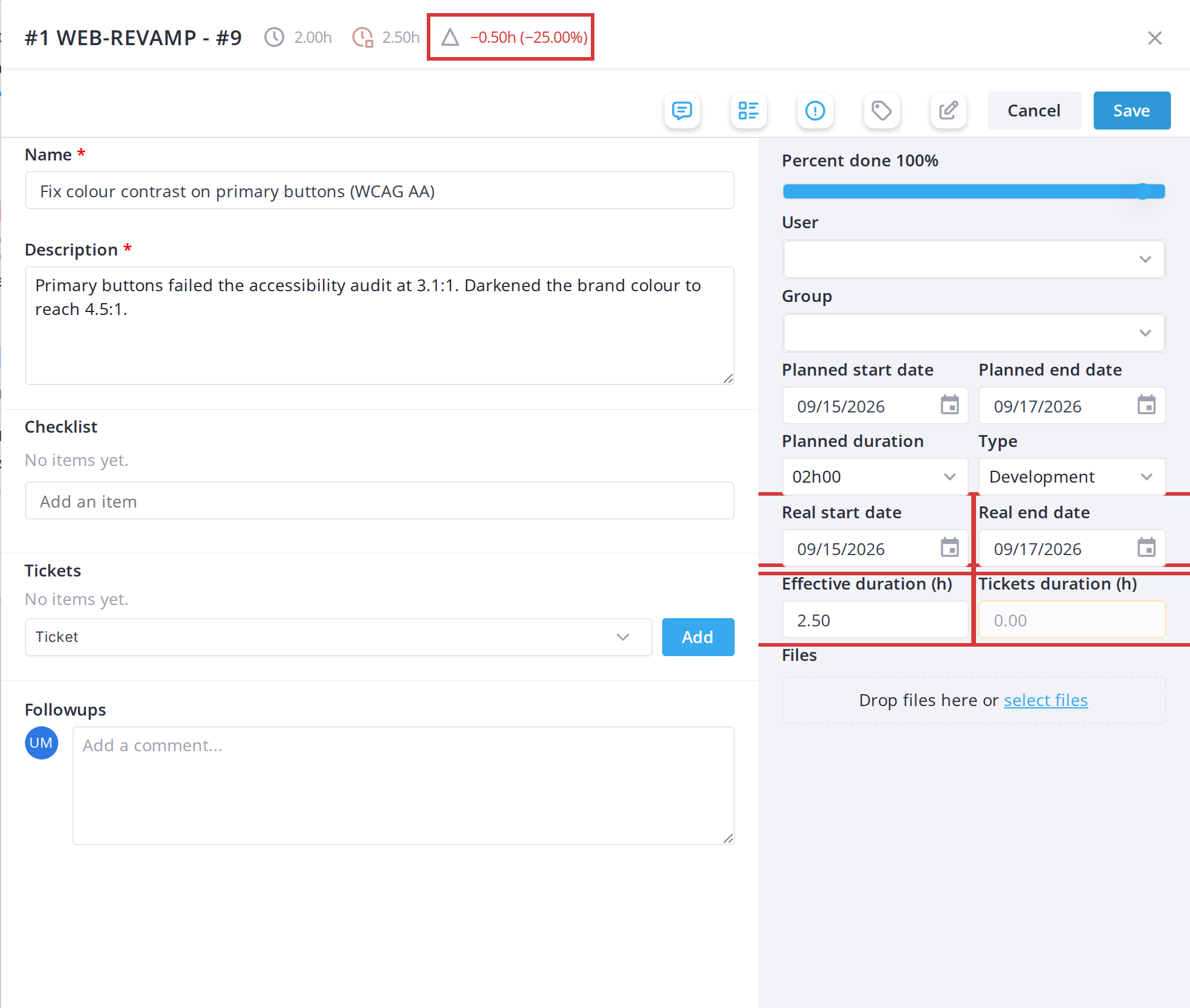
5.2.10.3 How the board fills in the real dates
Moving a task on the board fills in its real dates:
A user with the Edit real dates right can correct either date by hand in the card window; for everyone else the two fields are read-only.
5.2.10.4 Show only late tasks
Click the Late icon (a clock with an exclamation mark) in the toolbar to keep only the tasks whose time spent is over their planned duration. Click it again to show every card.
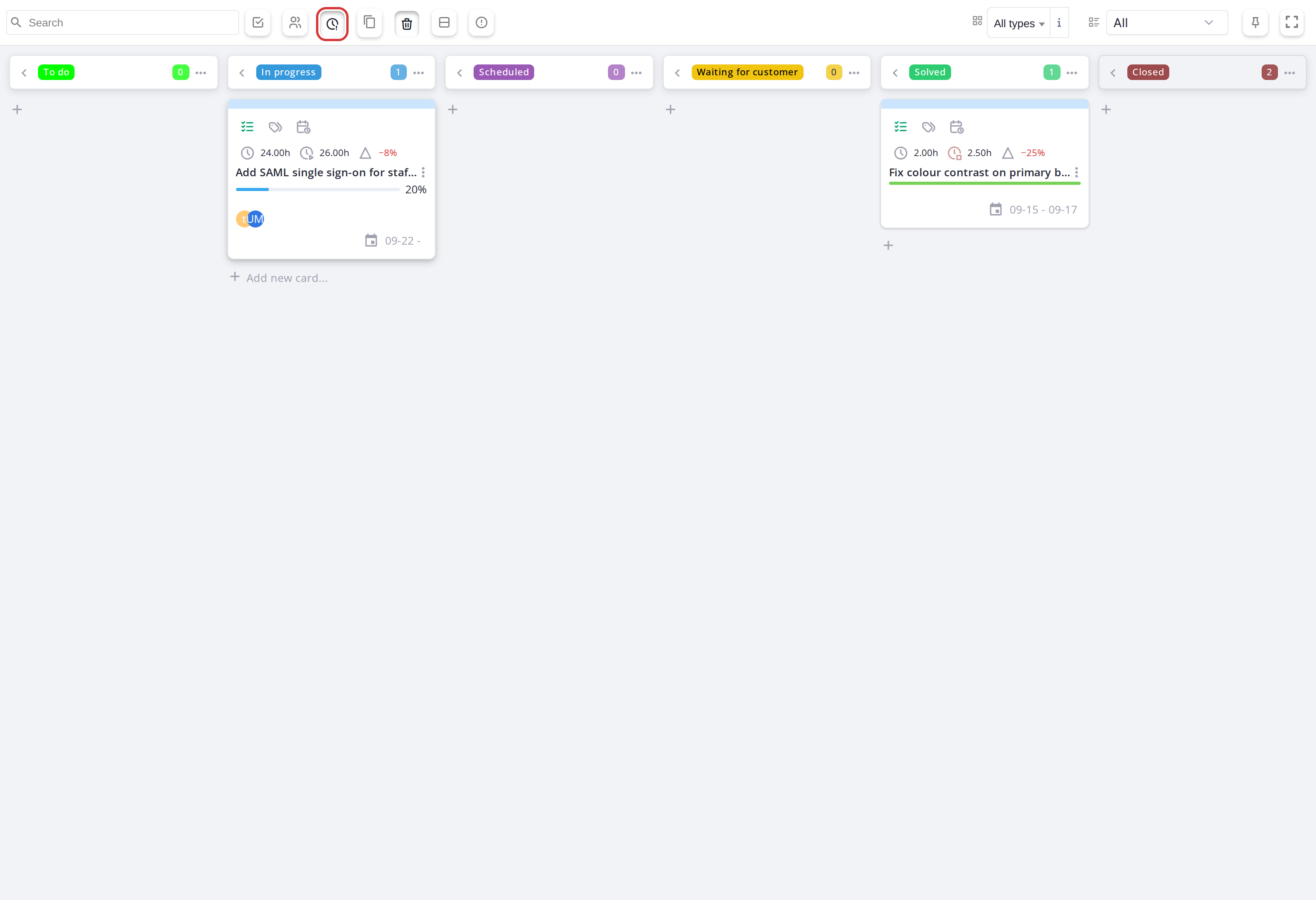
With Late on, only the two tasks over their planned hours remain
5.2.11 Tickets linked to a task
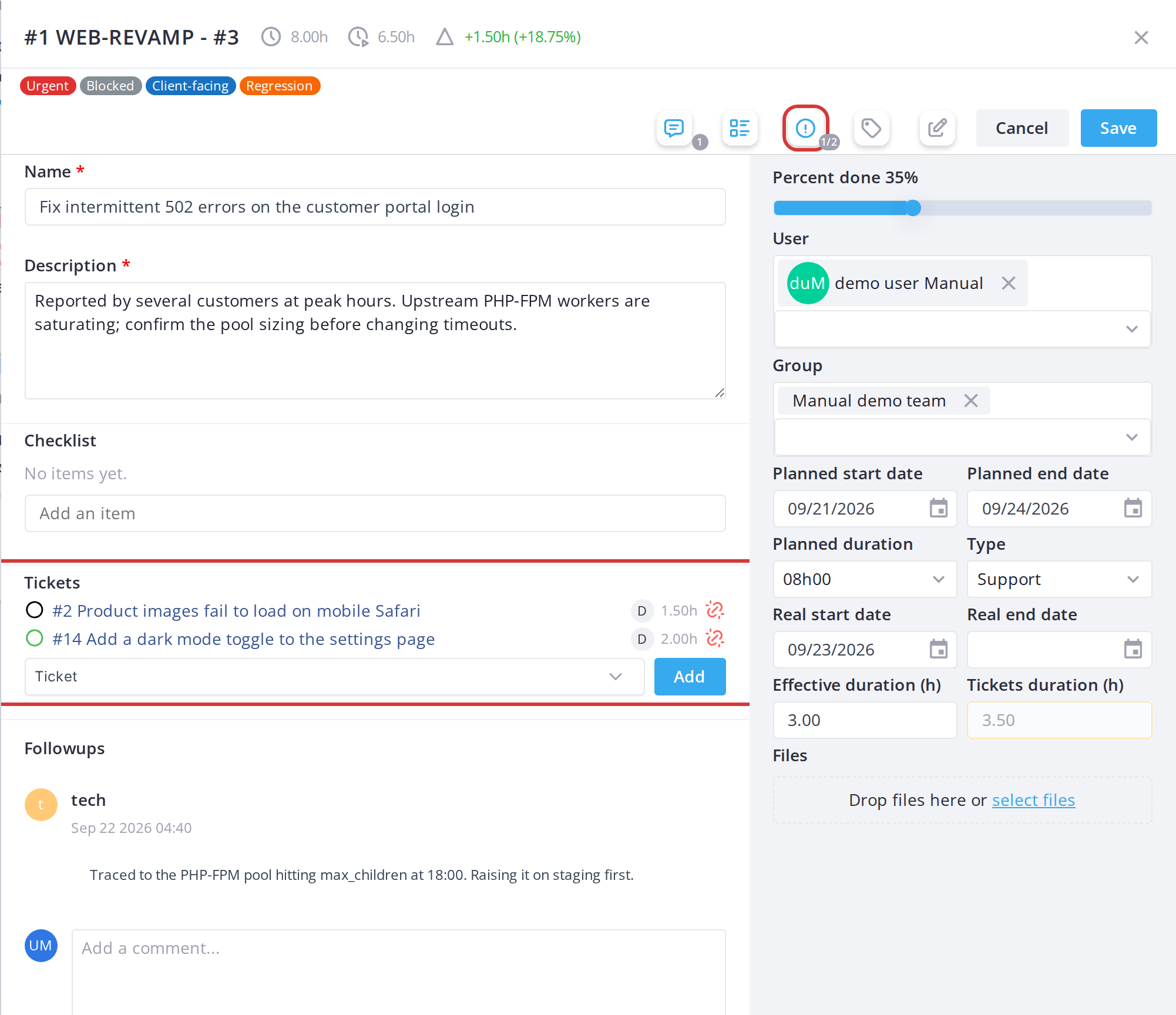
A task can have tickets linked to it, for example the incidents a fix is meant to solve. The task's card window lists them and lets you link or unlink tickets without leaving the board. Time logged on these tickets counts in the task's hours spent.
5.2.11.1 See the tickets of a task
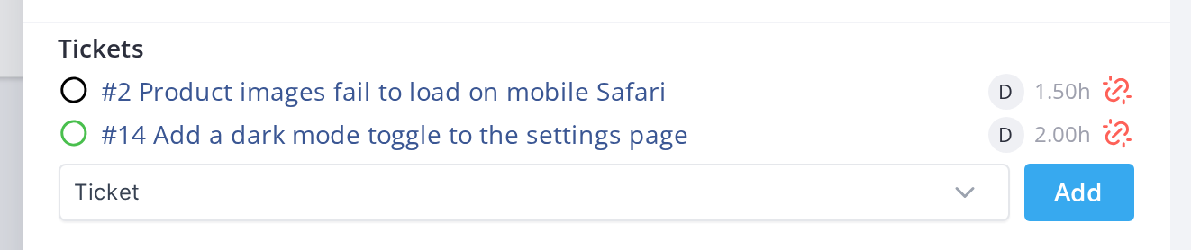
Open a task card. The Tickets section, under the checklist, lists each linked ticket with a ring showing its status, its number and title (a link to the ticket), its technician and the time logged on it. The ticket button in the window's button bar shows how many of the linked tickets are solved (here 1/2) and shows or hides the section.
5.2.11.2 Link or unlink a ticket
To link a ticket, pick it in the Ticket list at the bottom of the section and click Add. To unlink one, click the broken-link icon at the end of its row: the ticket is removed from the task only and stays linked to the project, so its own card stays on the board. Both need the Link tickets to a task right; without it the section is read-only.
Generated for Agile Project Management 2.2.0-
alpha.2beta.1 on GLPI 11.0 — 2026-09-25.27.