
5.1 The board


Part of the Agile Project Management manual — see also 1. Introduction, 2. What's New, 3. Scope, 4.1 General setup, 4.2 Labels, 4.3 Project task templates and checklists, 4.4 Notifications, 5.2 Working with cards, 5.3 Project task cards, 5.4 Ticket cards, 5.5 Labels, 6. Troubleshooting.
5.1.1 Choosing and changing a project type
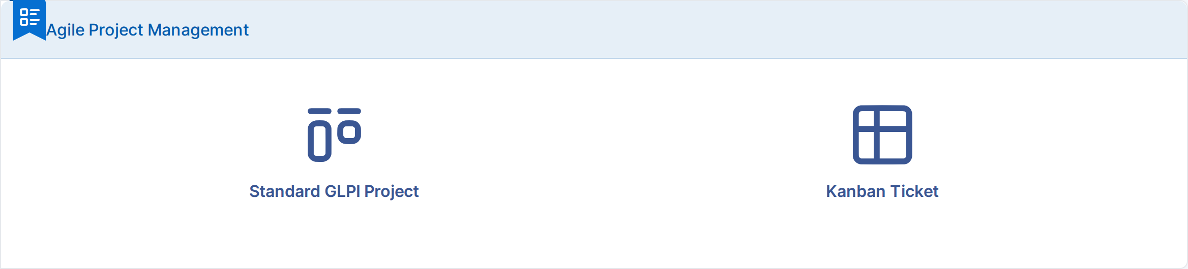
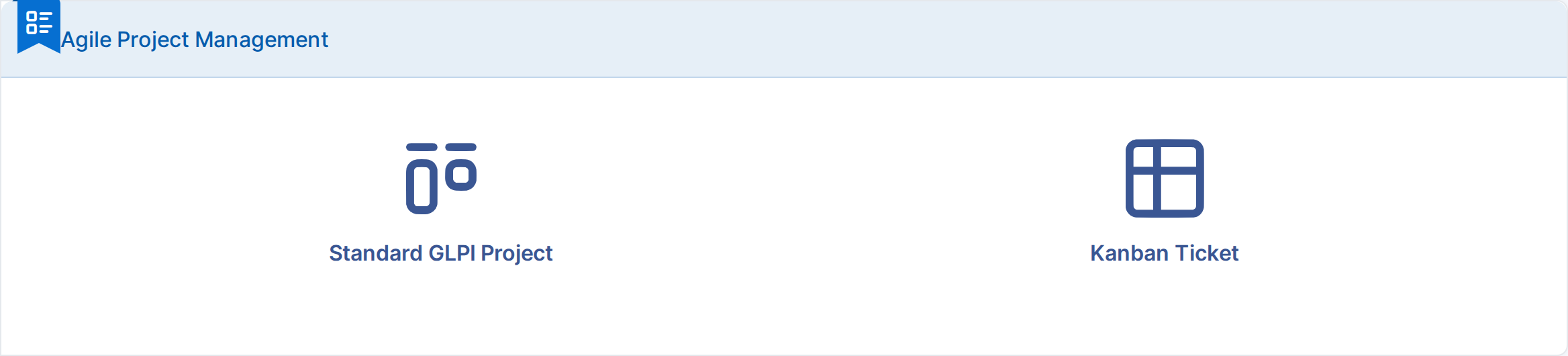
Every project is either a Standard GLPI Project, with GLPI's own project and task screens unchanged, or a Kanban Ticket project, managed from the plugin's board mixing project tasks and linked tickets. The type is chosen when the project is created and can be changed later by a user with the Change type right.
5.1.1.1 Pick the type of a new project
Choose Tools → Projects and click Add. Before the usual project form, the plugin asks which type of project to create. Kanban Ticket opens the project form; once saved, the project opens on its Kanban tab.
5.1.1.2 Change the type of one project
Open the project and choose its Agile Project Management tab. Pick the other Type and click Save. Nothing is deleted: a Kanban Ticket project turned back into a standard project keeps its board data, and returns to it if switched back. The change is written to the project's Historical tab.
The same tab has Calculate task progress from tickets and checklist, which overrides the global option of the same name for this project: keep the global setting, or switch automatic progress on or off for this project only. The global value is shown next to the field while it is inherited.


5.1.1.3 Change the type of several projects at once
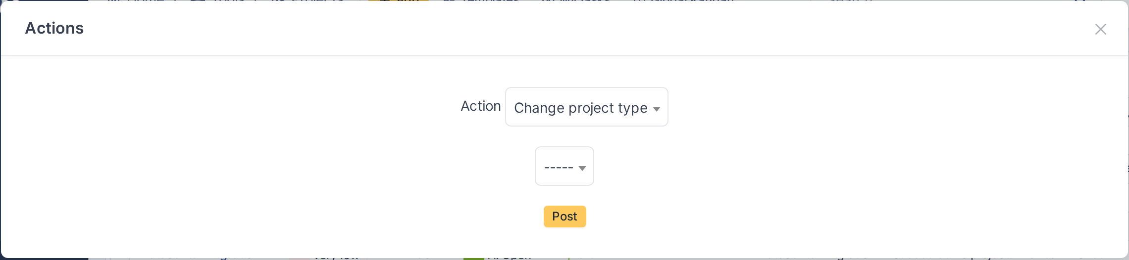
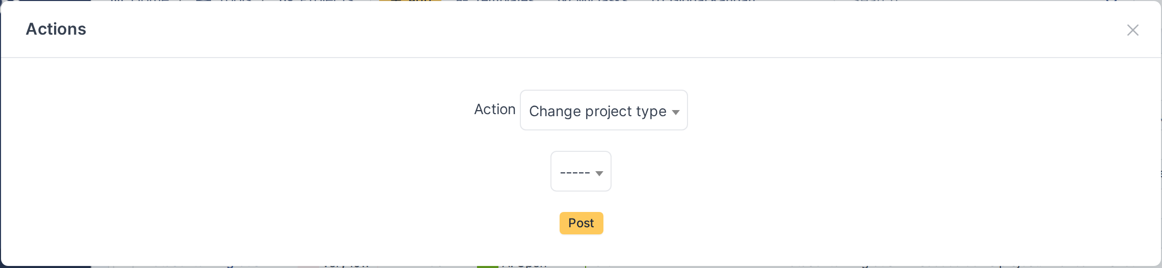
In Tools → Projects, tick the projects, click Actions and choose Change project type. Pick the new type and click Post. Every project changed is logged in its own Historical tab.
5.1.2 The Kanban board
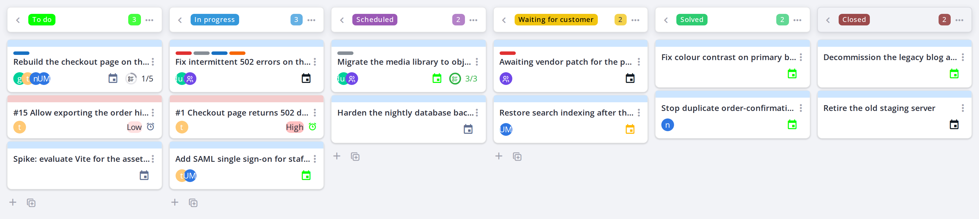
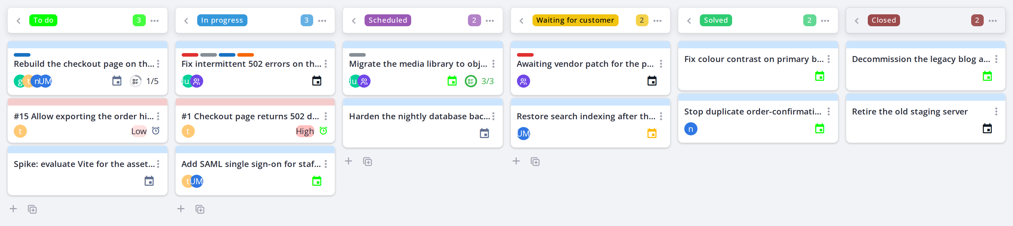
A Kanban Ticket project shows its work as a board instead of the standard project task list. Each column is a project state, and each card is either a project task or a ticket linked to the project. The two are given different background colours, so which kind of work a card represents is obvious without reading it.
5.1.2.1 Open the board
Open the project and choose its Kanban tab. The board replaces the usual task list and fills the width of the page.
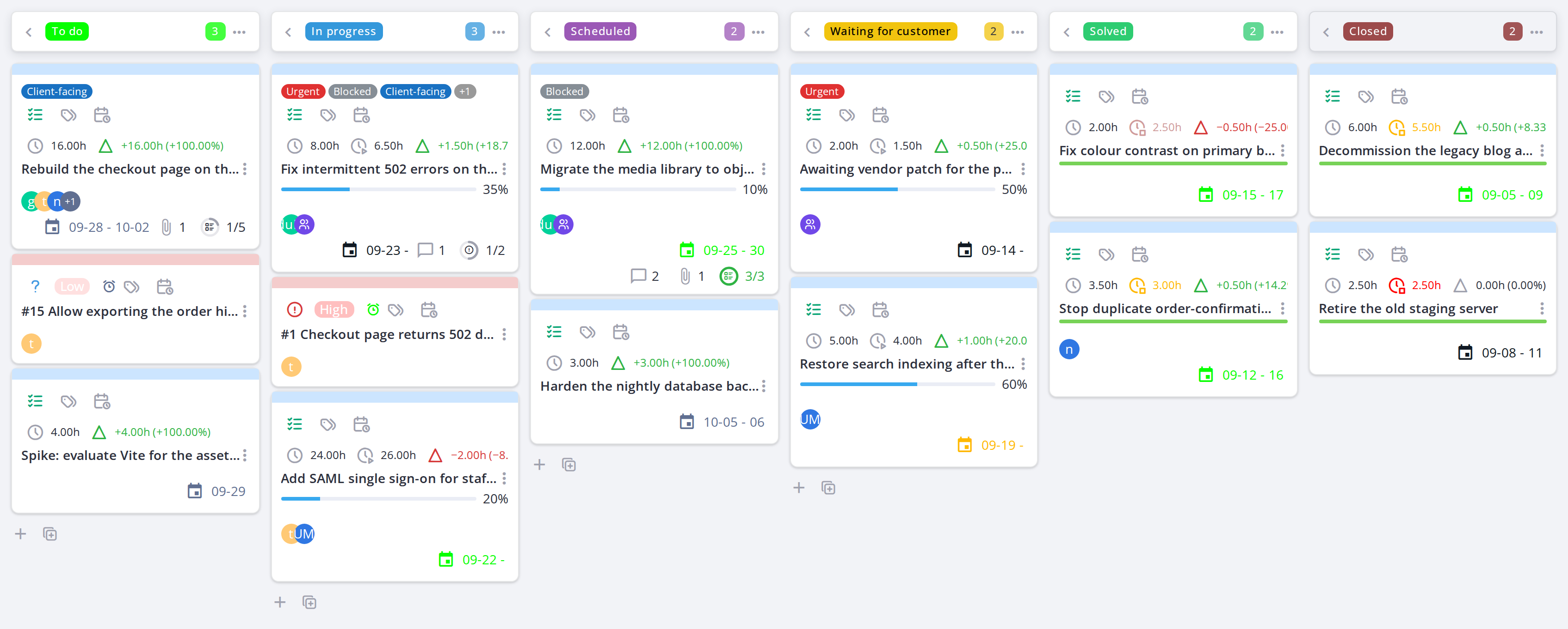
A Kanban Ticket project, one column per project state
5.1.2.2 Read the project title
At the top of the project page, the title label shows the project's code and state; hover it for the project's full name. After them come its key figures, with the same icons and colours as the task cards:
- Planned end date of the project.
- Percent done.
- Planned duration and effective duration (the time actually spent).
- Variance: planned minus effective, in hours and as a percentage; positive and green while there is time left, negative and red once over budget.
Hover a figure for its name. On a narrow screen some figures are hidden to make room. The label takes the main menu's colours from the active GLPI theme.


5.1.2.3 Columns are project states
Each column is a project state, chosen in the configuration for one of the six ticket statuses, so the board always reads from new work on the left to closed work on the right. A column title is the state's name without its sort prefix, so a state named 1. To do shows as To do. The number beside a column name is how many cards it currently holds, which is the quickest way to spot work piling up in one place. In this example the columns are To do, In progress, Scheduled, Waiting for customer, Solved and Closed.
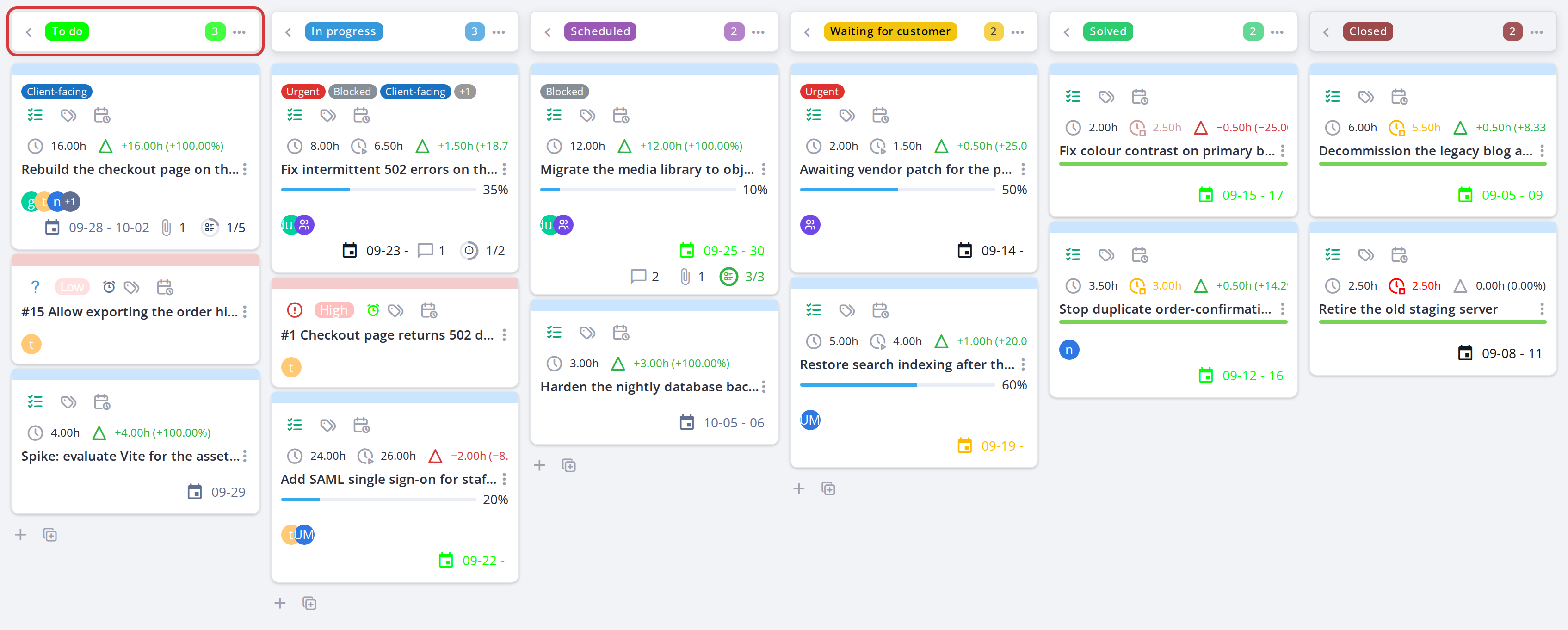
A column, its name and its card count
5.1.2.4 Read a card at a glance
Without opening anything, a card tells you: its title, the project code it belongs to, its type, who it is assigned to, how far along it is, its planned and spent hours, its dates, and whether it carries labels, a checklist, comments or attachments. Every icon on it is explained in Icon meanings and tooltips, and the hours in Time on a task.
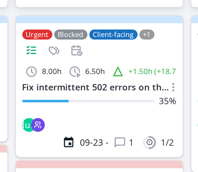
One card, carrying labels, assignees, a comment and linked tickets
5.1.2.5 Open a card
Click a card to open it. Everything about that task or ticket is edited here rather than on the board itself — see The card window.
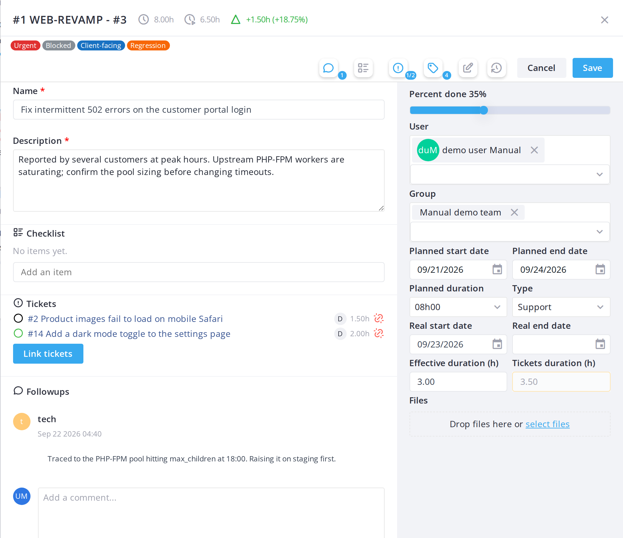
Note: Task cards and ticket cards are given the two background colours set in Setup, so the two kinds of work stay distinguishable even on a full board.
Note: The board only lists projects that are not templates, not deleted, and whose state is not flagged "finished" in Setup > Assistance > Project states — a project can stop appearing here simply because its state changed to a finished one.
5.1.3 The global Kanban view
Instead of opening one project at a time, Kanban in the main menu shows every Kanban Ticket project the user can see on a single aggregated board, with each card labelled with its project name and code.
5.1.3.1 Open the global Kanban view
Choose Kanban from the main menu. The same filters, card actions and drag-and-drop behaviour apply here as on a single project's board — the only difference is that cards from every visible Kanban project are mixed together.
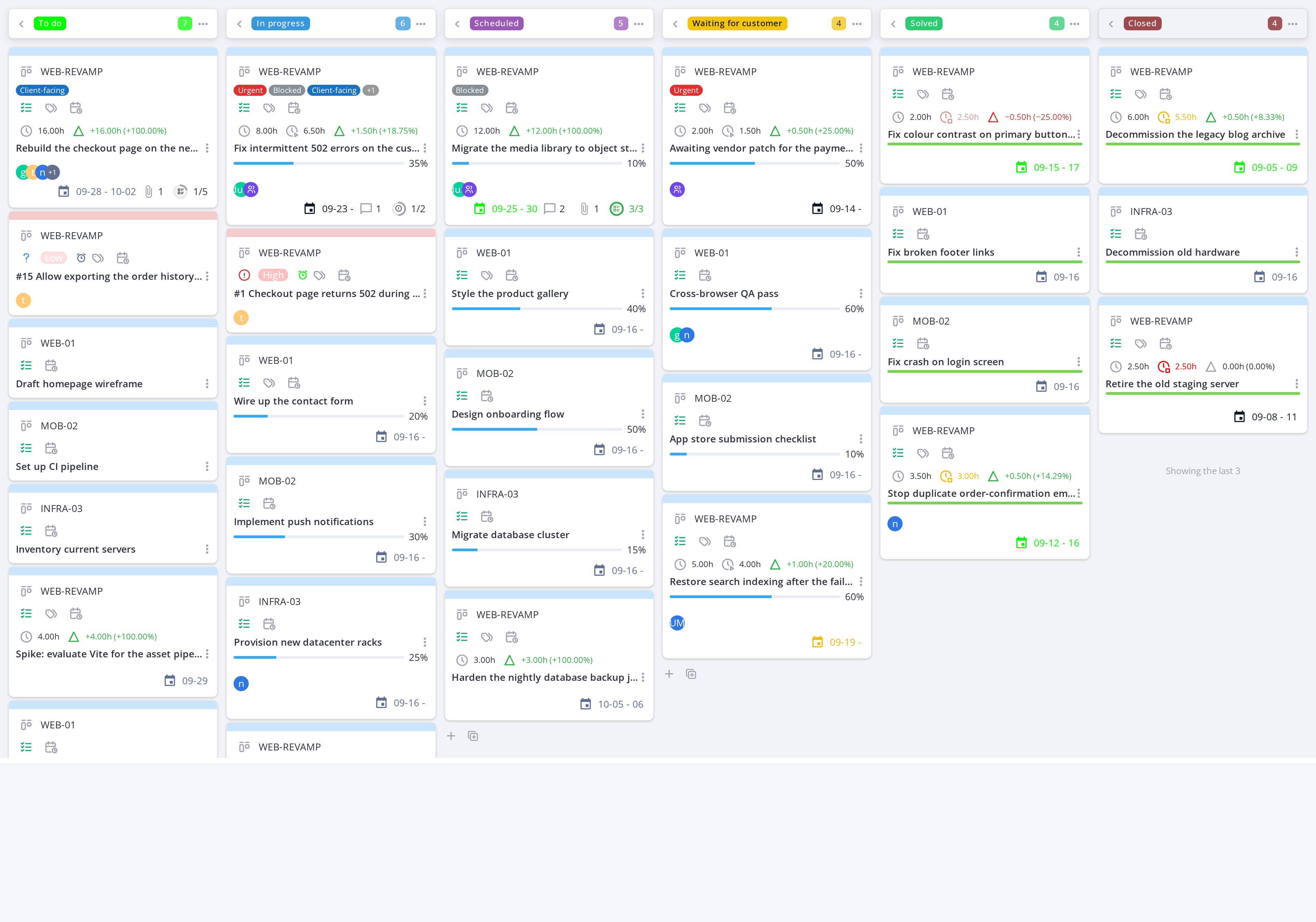
Note: The global board only shows the projects and tickets GLPI already lets you see; it adds no visibility of its own.
Note: Each card displays its project name and code alongside its title, so you can tell which project a task or ticket belongs to at a glance.
5.1.4 Columns and collapsing them
Columns are project states. They are not created, moved or deleted on the board: an administrator chooses them in the configuration (see Configuration, Kanban Ticket block), and the board shows them in that order.
5.1.4.1 Read a column header
Each column header shows the state name, without its sort prefix, and the number of cards in the column. A card with no state, or with a state not mapped to any column, goes to an extra No status column at the far left. It is shown only while it has cards and disappears as soon as the last one is moved out. It has no add buttons: a new card always starts in a column with a project state. A collapsed column shows its card count under its name, and stays collapsed when the board reloads.
5.1.4.2 Collapse a column
Click the left-pointing arrow icon at the left of a column header to collapse it, hiding its cards but keeping the column label visible vertically. Click the right-pointing arrow to expand it again.
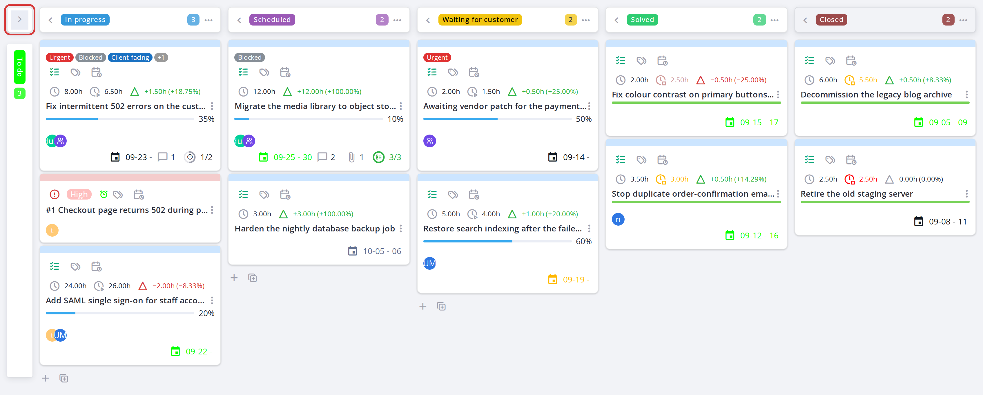
The first column collapsed to a narrow strip
5.1.4.3 The Closed column
The Closed column shows only its most recently closed cards (3 by default, set by Closed cards shown in the configuration) and a "Showing the last 3" note while more are closed; its header counts them all. Older closed cards are not loaded, which keeps a board with a long history fast; they remain in GLPI's own project and ticket lists. Dropping a card into Closed still works: it becomes the newest shown card.
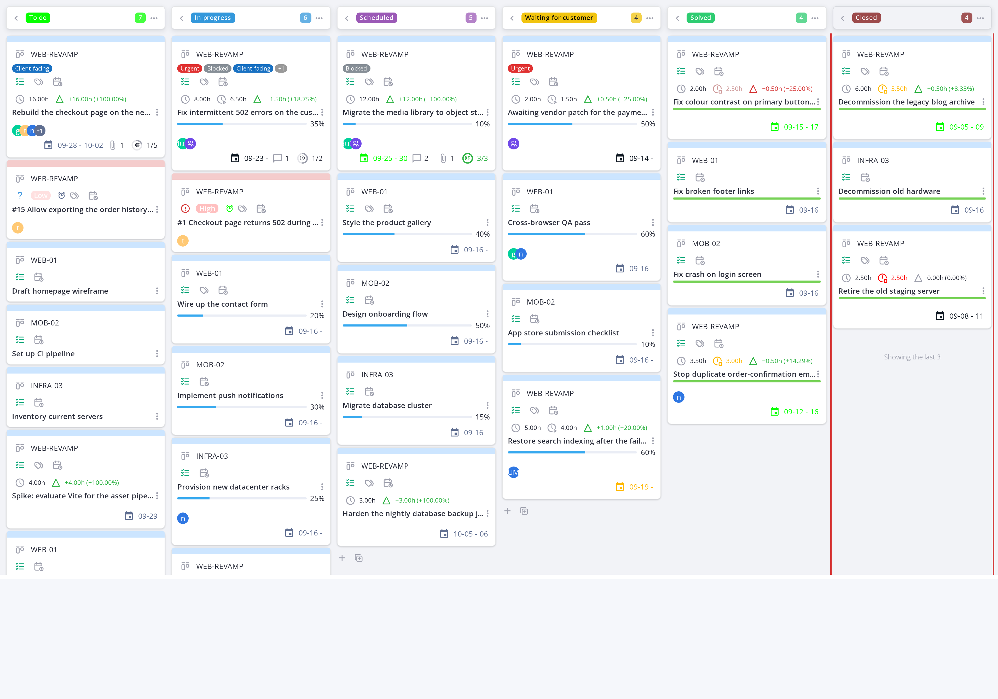
On the global board, the Closed column keeps its last 3 cards and counts the rest
5.1.5 Filtering the board and saving a personal filter
The board can be filtered by project, assigned user, group and card type. A filter is saved per user, not per project — it is remembered the next time you open any Kanban board.
5.1.5.1 Open the filter panel
Click the search icon in the toolbar above the board. The filter inputs appear: project, user, group and card type. Combining several narrows the board to cards matching all of them.


5.1.5.2 Save the filter
Once a combination is useful, it is saved automatically for that user and reapplied on the next visit — there is one saved filter per user, replaced each time a new combination is applied.
5.1.6 Moving a card between columns
Task cards and ticket cards move differently. A task card can be dragged to any column, which changes the task's project state. A ticket card's column follows the ticket's own status, through the status mapping of the configuration; on the board it can only be put on hold.
5.1.6.1 Drag a card to another column
Drag a task card from its current column and drop it onto another. The task's state changes immediately, its real dates are filled in as described in Time on a task, and the Update Task Status notification is sent.
A ticket card can only be dragged to the Pending column: the Set the status to pending window opens for the followup and the pending reason, and the ticket is put on hold. Dropping a ticket anywhere else is refused with a message. Other status changes (assigning, solving, closing) are made in the ticket itself, and its card then moves to the matching column on its own.
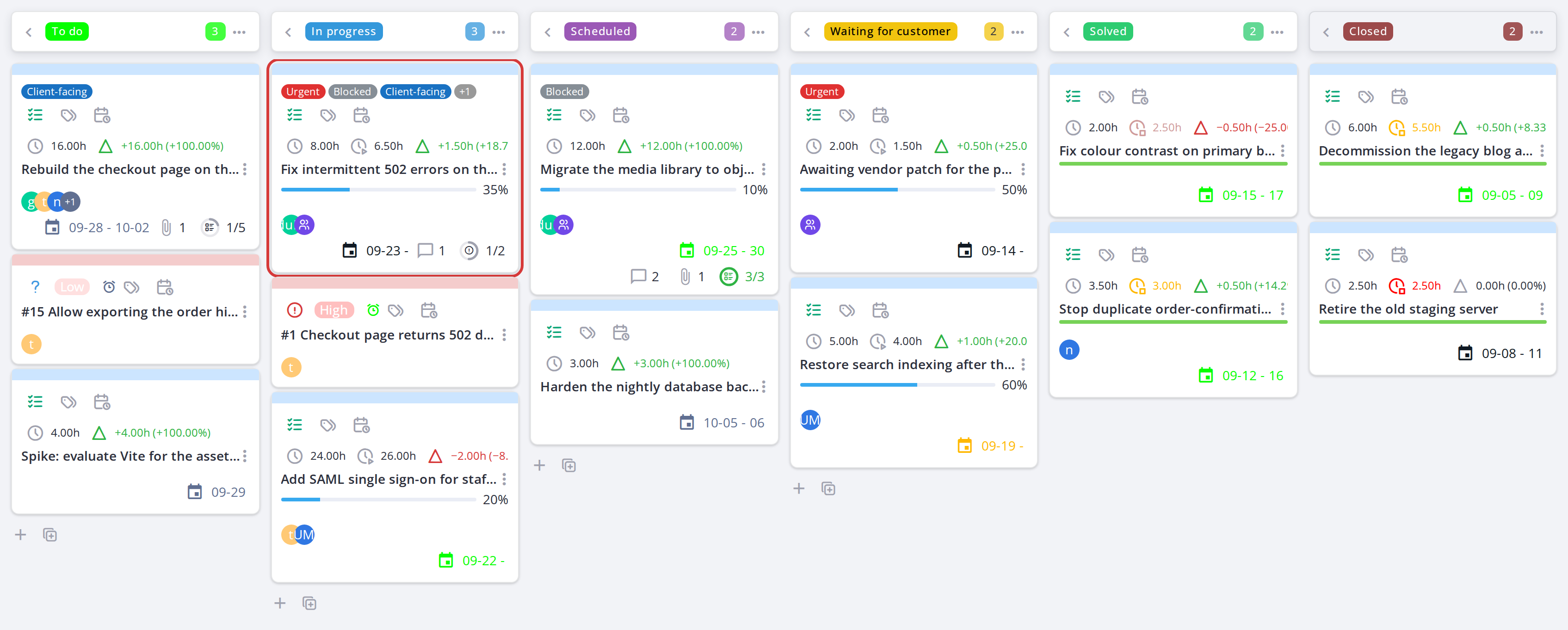
Note: Moving a card requires the Move a card right; without it the card cannot be dragged at all (see Permissions in Setup). A card can't be dropped on the No status column: the board refuses it with a message asking for a column with a project state.
5.1.7 Board toggles, menus and view options
The toolbar above the board offers several toggles and dropdowns to control what you see and how the board behaves. Its buttons are grouped by purpose: project and label filters, user filters, quick filters, actions, then view options. Hover any button for its name.
5.1.7.1 Show only my tasks
Click the checkbox icon to filter the board to show only cards assigned to you. Click again to show all cards.
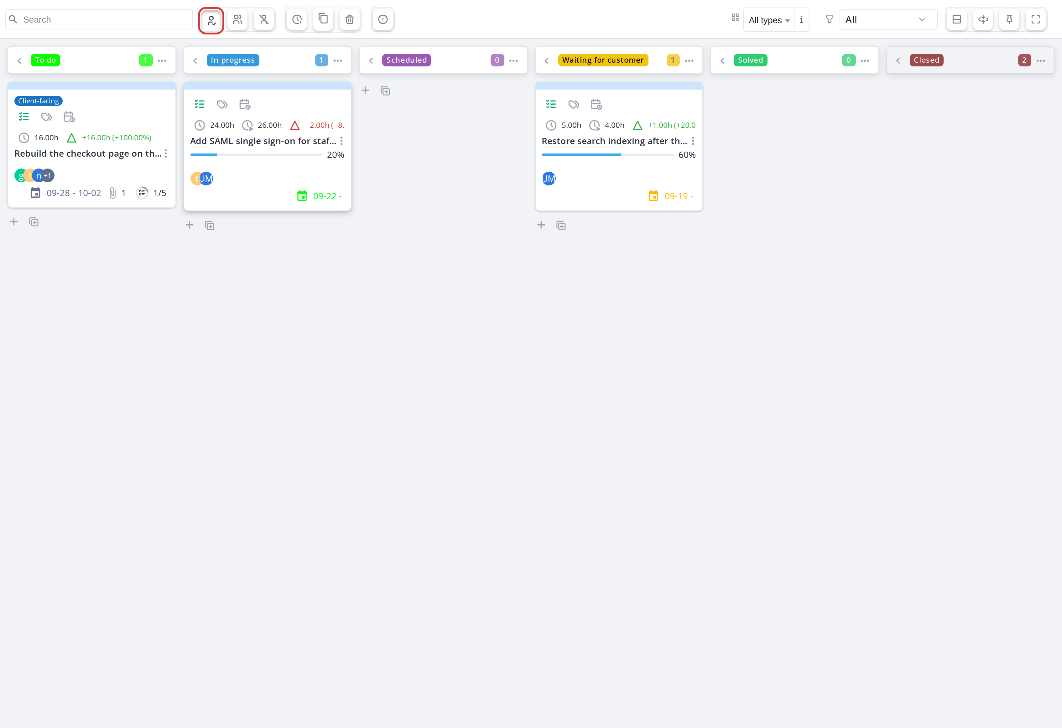
With the toggle on, the board keeps only the cards assigned to you
5.1.7.2 Show only my groups' tasks
Click the users icon to filter the board to show only cards assigned to groups you belong to.
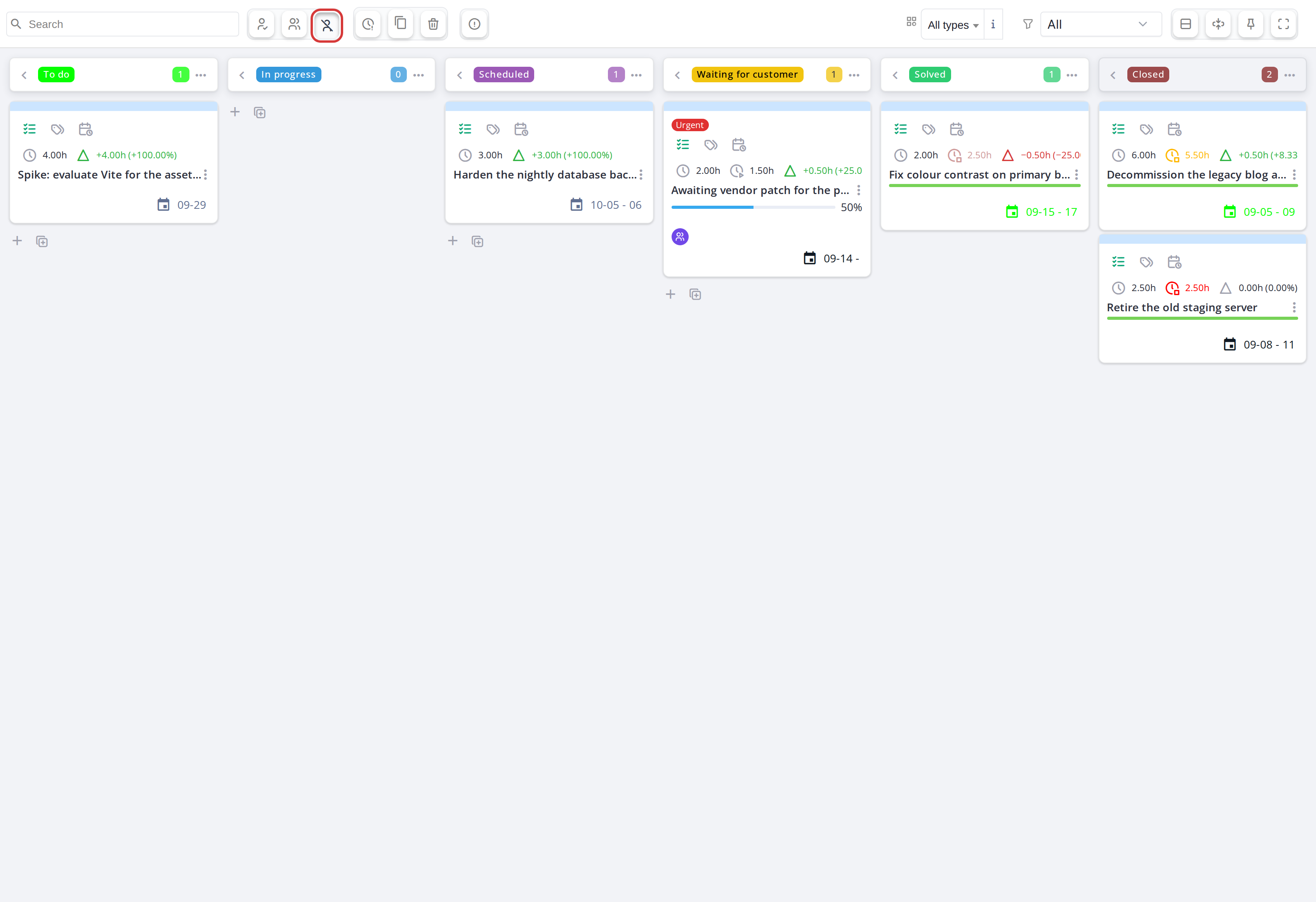
5.1.7.3 Show only unassigned cards
Click Unassigned to keep only the cards with no user assigned, for example to pick up work nobody owns yet. It can be combined with My tasks and My groups tasks.
5.1.7.4 Show tickets linked to a task
A project has two kinds of ticket cards. A ticket linked to the project itself always has its own card. A ticket linked to one of the project's tasks is counted on that task's card (the ticket ring) and, by default, has no card of its own. Click the Show tickets linked to a task icon to show those tickets as cards too: they have a dashed border in the task colour, and an icon next to their date names the task. Click it again to hide them.
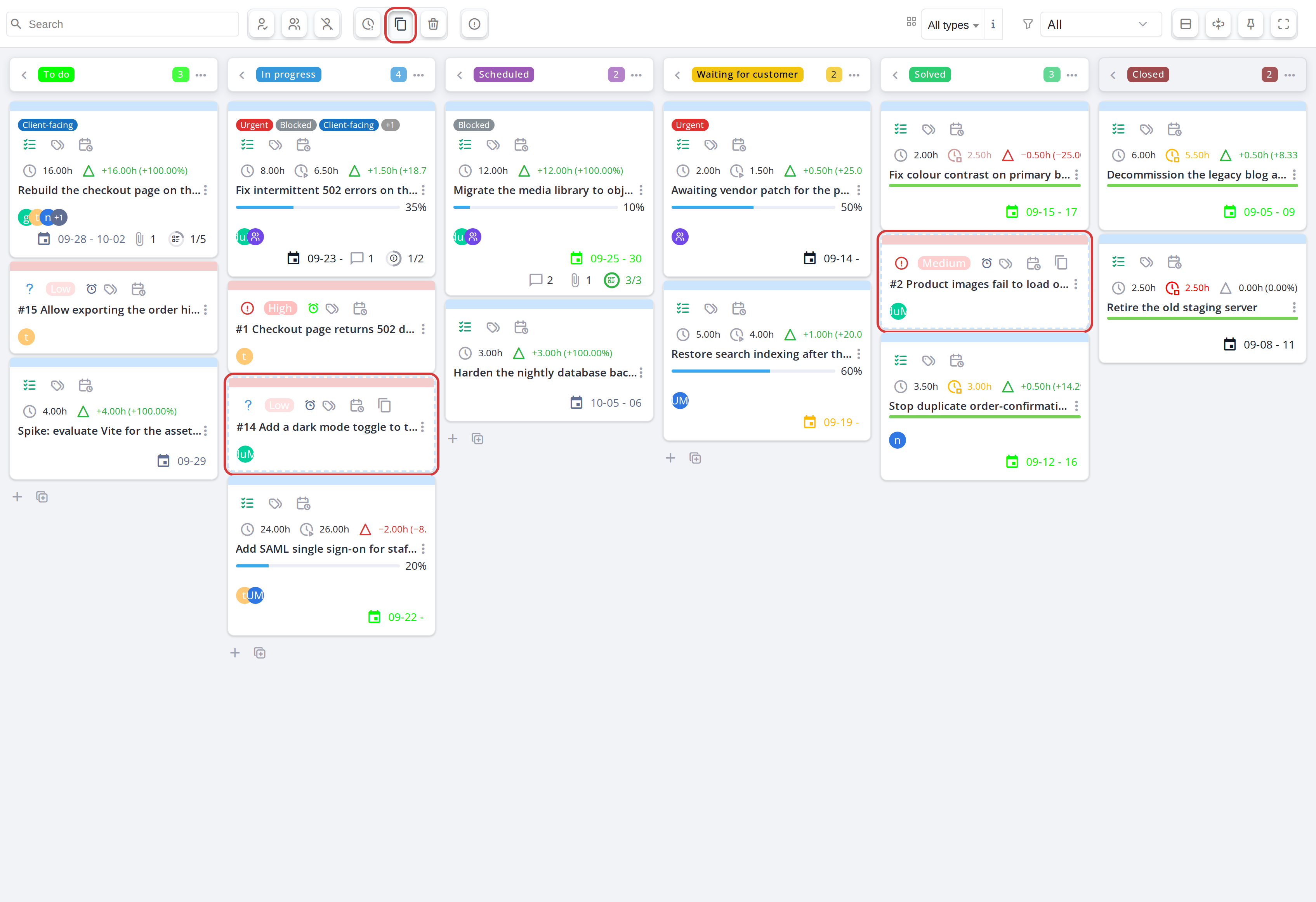
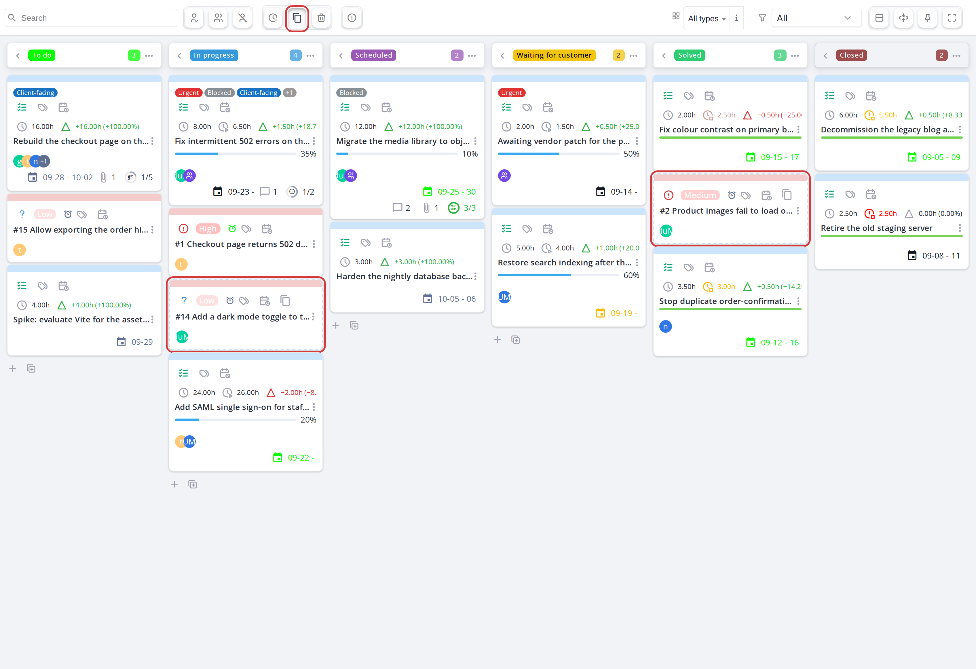
Tickets linked to a task, shown as cards with a dashed border
5.1.7.5 Show deleted tasks
Click the trash icon to display deleted task cards on the board (grayed out, marked as deleted). Deleted cards can be restored or purged via their detail panel.
5.1.7.6 Group by item type
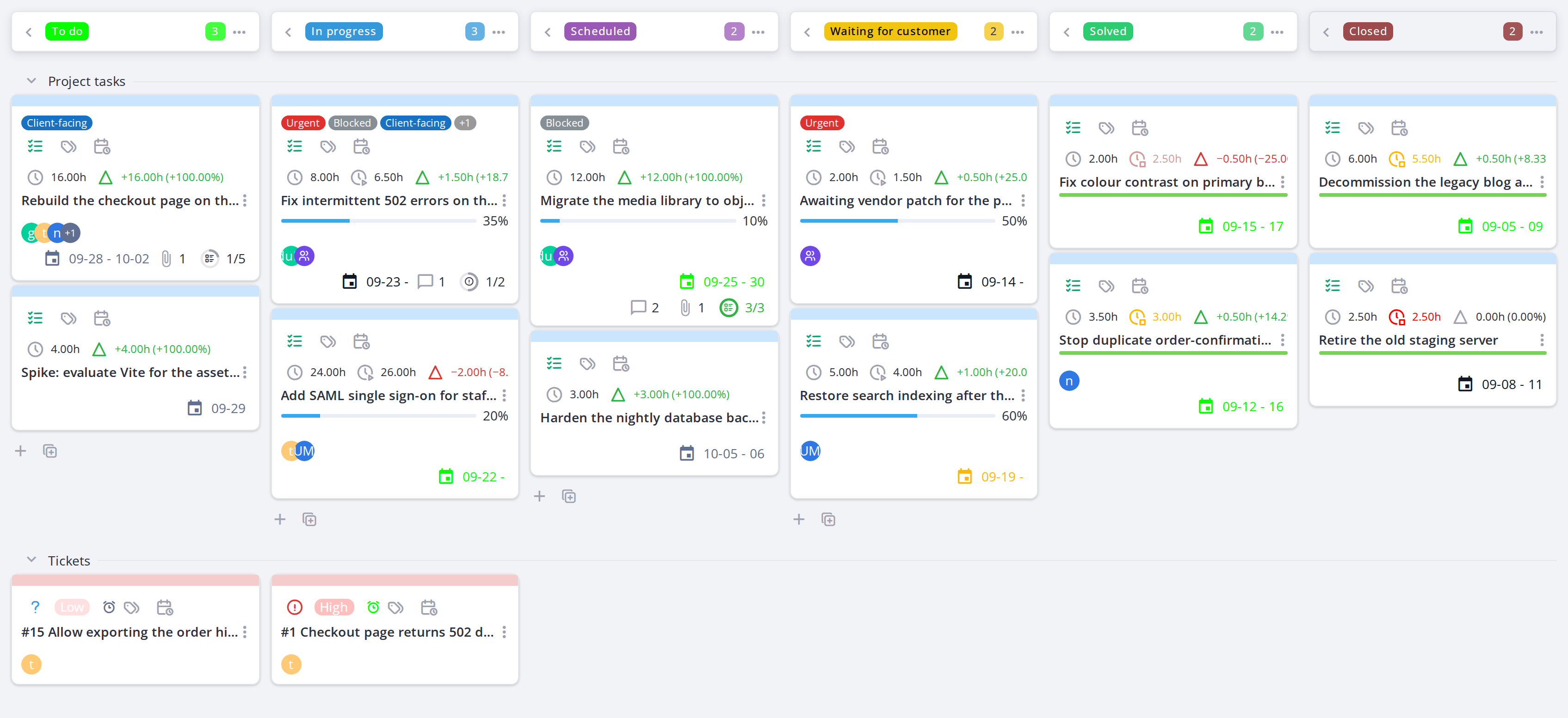
Click the rows icon to organize the board into swimlanes — one for project tasks, one for tickets. Cards stay in their columns but are grouped by type for easier scanning.
5.1.7.7 Show only one person's or group's cards
Click an avatar on a card to keep only the cards of that user or group. A chip with the name appears in the toolbar; click its cross, or the same avatar again, to show every card. This replaces My tasks and My groups tasks while it is on.
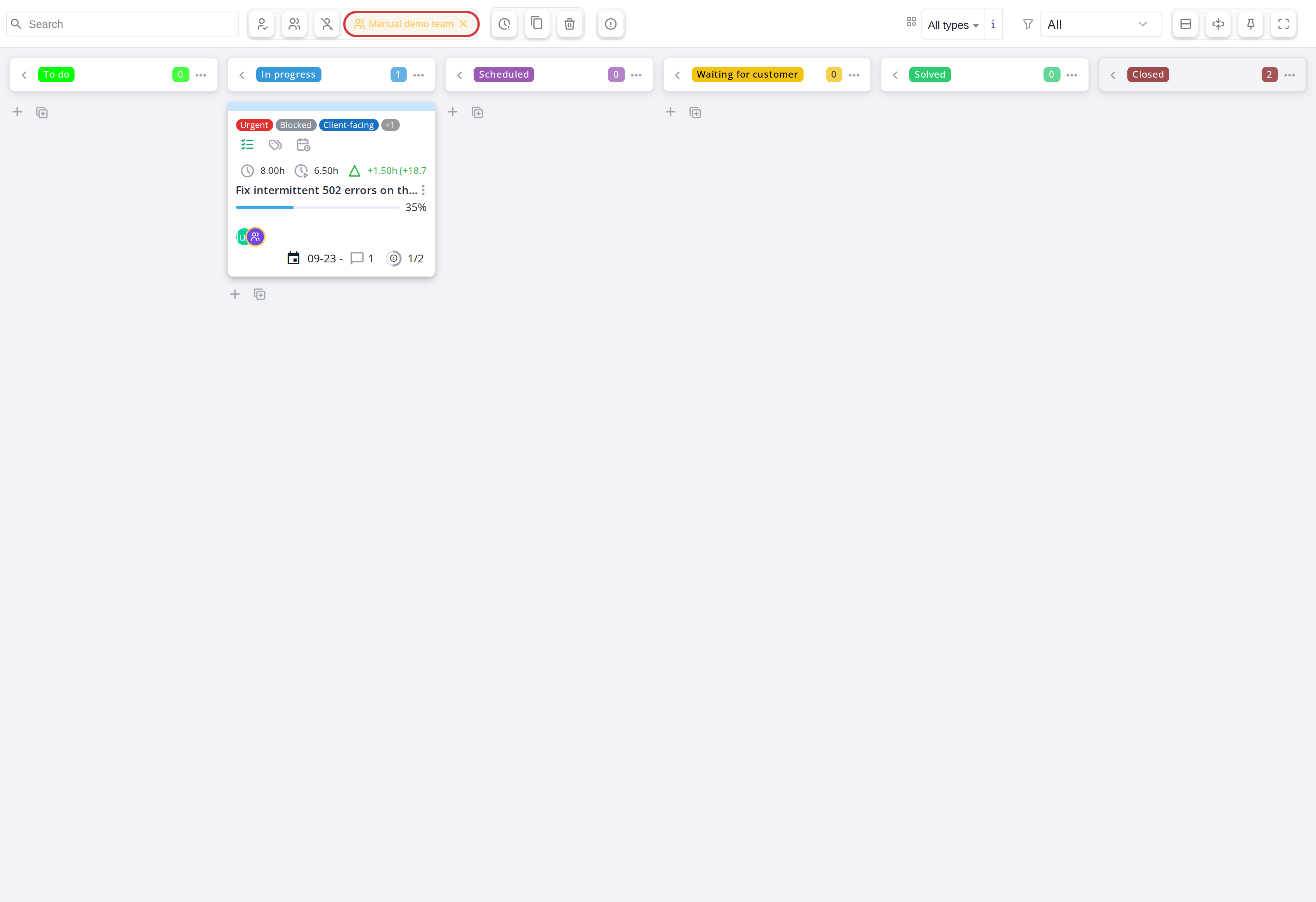
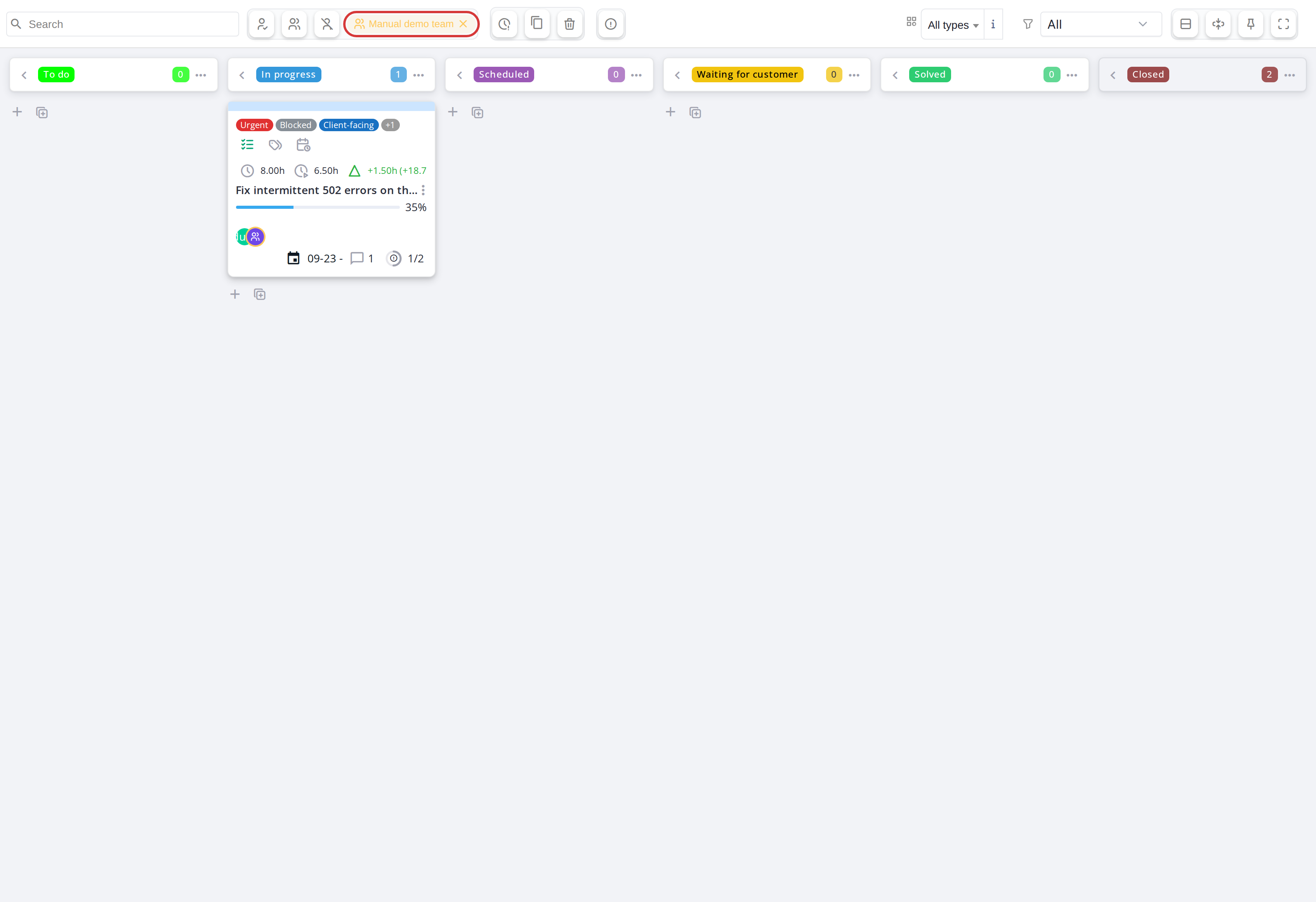
The board filtered on one group; the chip in the toolbar resets it
5.1.7.8 Show only a card type
Use the Show dropdown, after the filter icon, to show all cards, only project tasks, or only tickets.
5.1.7.9 Filter by project (global Kanban only)
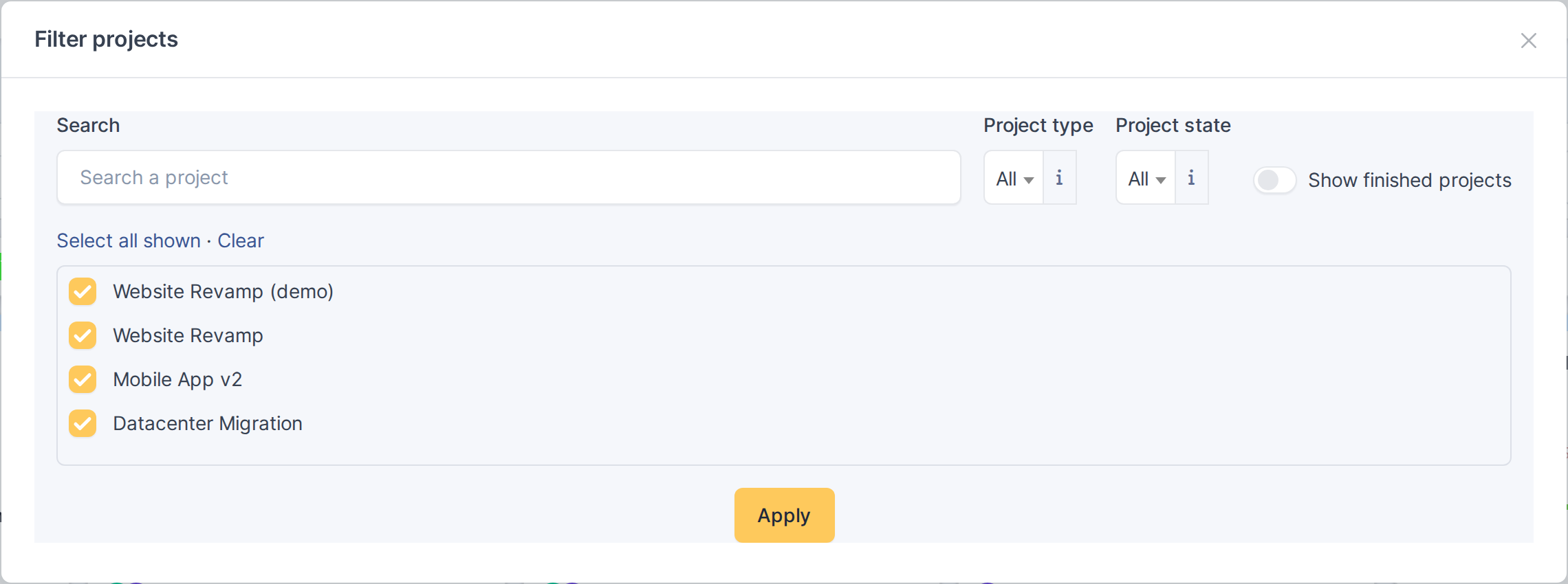
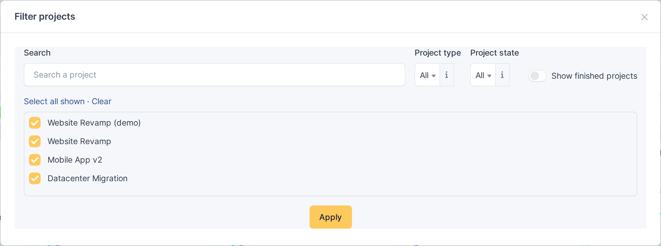
On the global Kanban, click the filter icon (Filter projects) to choose which projects the board shows. Search by name, narrow the list by Project type and Project state, switch on Show finished projects to include finished ones, and tick the projects to keep (Select all shown / Clear), then click Apply. The badge on the icon shows how many projects are selected. Closing the window applies the choice without reloading the page, and it is saved for your next visit.
5.1.7.10 Filter by label (global Kanban only)
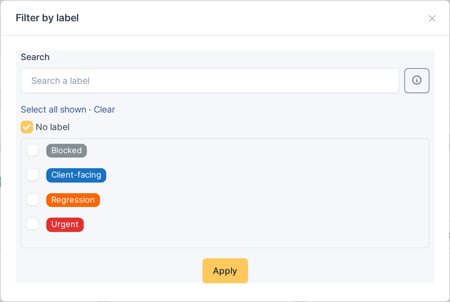
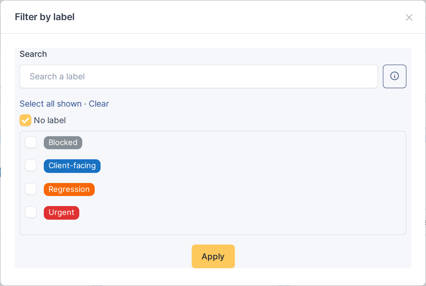
On the global Kanban, click the tag icon (Filter by label) to show only the cards carrying the ticked labels. No label keeps the cards that have none. See 5.5.3 Filtering the board by labels.
5.1.7.11 Link tickets to a project
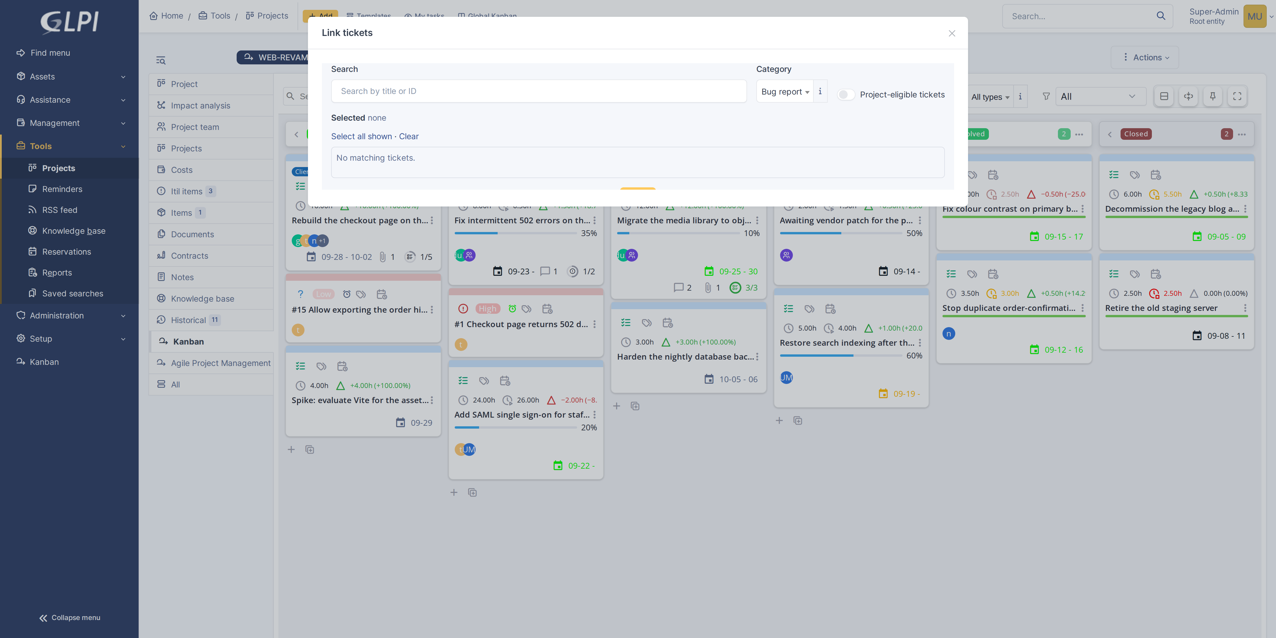
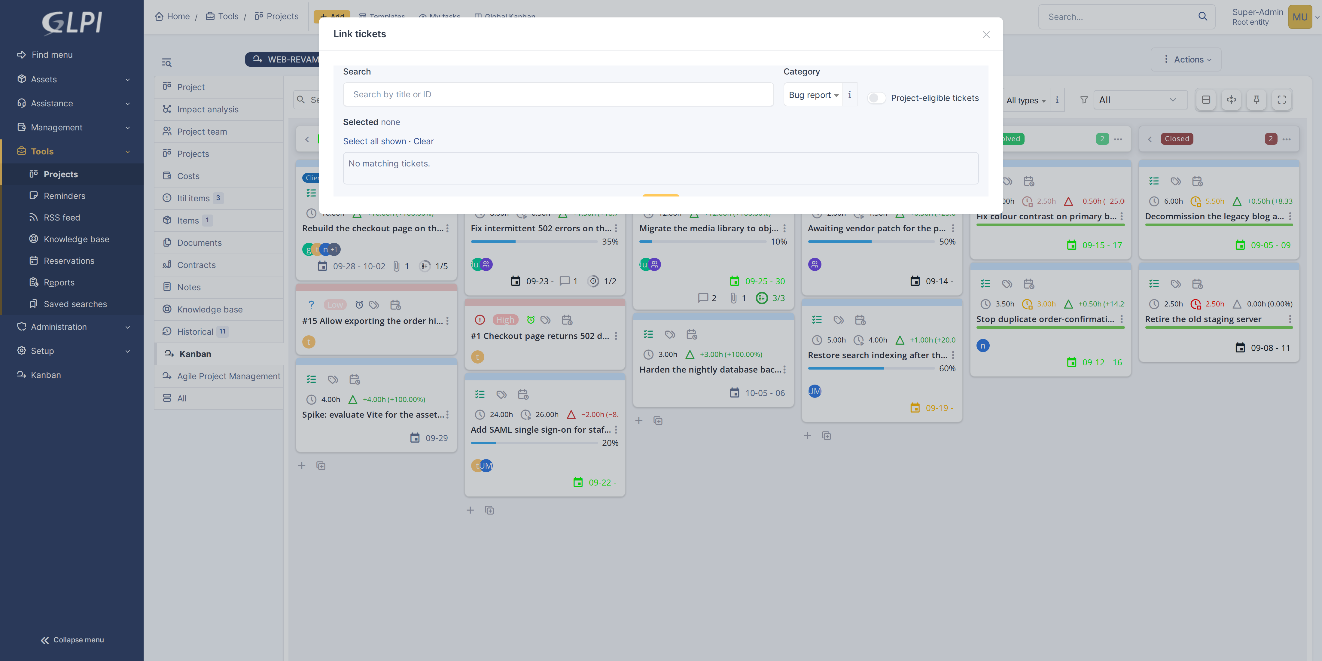
Click Link tickets to open a window where you can search for existing tickets and link them to this project. It works like the Filter projects window: search, then tick tickets one by one or use Select all shown and Clear. The label filter and a task's own Link tickets window work the same way.
5.1.7.12 Expand to fullscreen
Click the expand icon to hide GLPI's sidebar and header, giving the board the entire window. Click again to restore them.


5.1.7.13 Switch to docked editing
Click the pin icon to open cards for editing in a docked sidebar on the right instead of a modal popup. The docked editor overlaps the right side of the board; the columns narrow by at most a quarter to make room, so the board stays usable. Click again to switch back to modal editing.
5.1.8 Compact cards
Compact cards fit more of a busy board on the screen, showing each card on two lines.
5.1.8.1 Switch to compact cards
Click Compact cards in the toolbar's view options. Each card shrinks to two lines: the title, then the people and groups, dates and counters. Labels become thin coloured strips; hover one for its name. The second line shows as many people and groups as fit, then a +n whose tooltip names the rest. Click the button again for full cards.
The choice is remembered for you, separately for a project's board and the global board.
Generated for Agile Project Management 2.2.0-beta.1 on GLPI 11.0 — 2026-09-27.