
WhiteLabel user guide
- Login & Settings
- Tickets
- Create a Ticket
- Change the ticket category
- Change Ticket Actors
- Create a Task
- Plan a task
- Create a Followup
- Create and modify Solutions
- View ticket history
- Upload Documents
- Asset Handover
- Geolocation
Login & Settings
Login methods
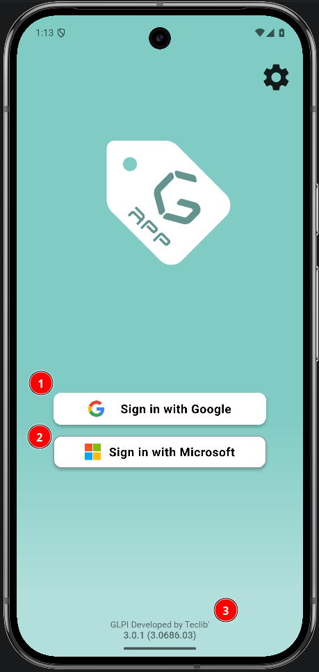
The login screen presents the authentication methods enabled for the app. The GLPI server URL is preconfigured; no server address needs to be entered.
Change language
the default language as is the system language but if you want to change it, you can from settings screen
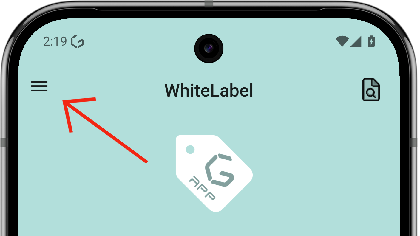
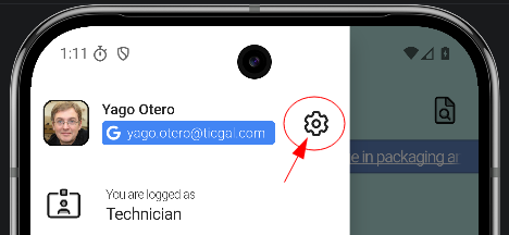
- From the main screen, open the side menu.
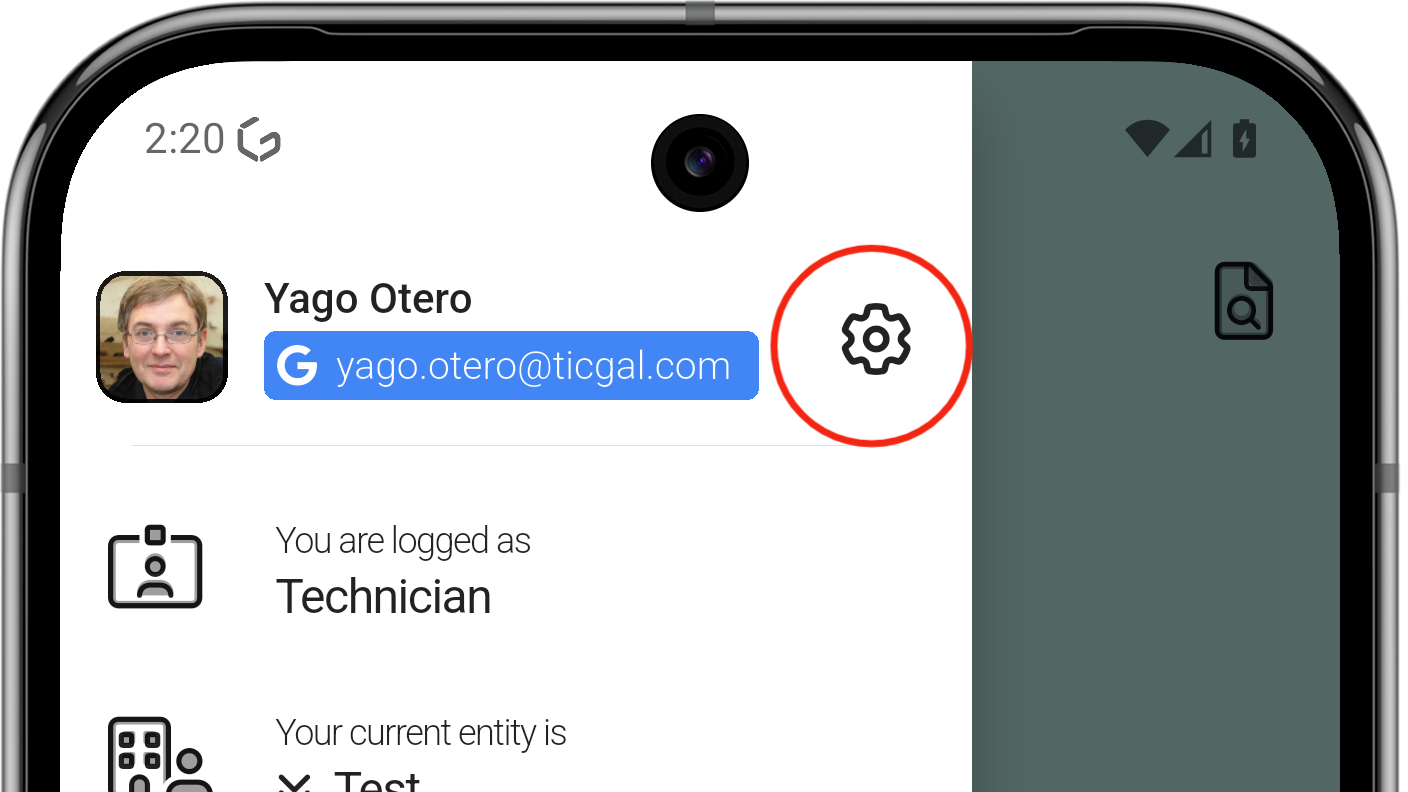
- Tap the gear icon to open Settings.
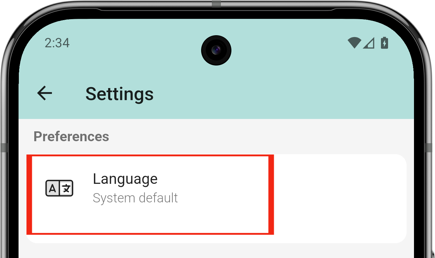
- Find the Language option
- The app asks to log in again; the process is complete.
Do Not Disturb
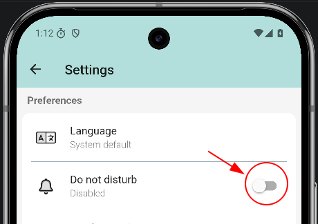
Do Not Disturb silences all app notifications. While active, notifications are logged silently instead of producing sound or vibration.
Enable Do Not Disturb
Open Settings from the login screen (or the drawer when logged in), then toggle Do not disturb on.
If you use TAM (clock-in/out), Do Not Disturb turns on automatically outside working hours and turns off when your workday starts. You can always turn it on or off manually.
Do Not Disturb active
Clean cache
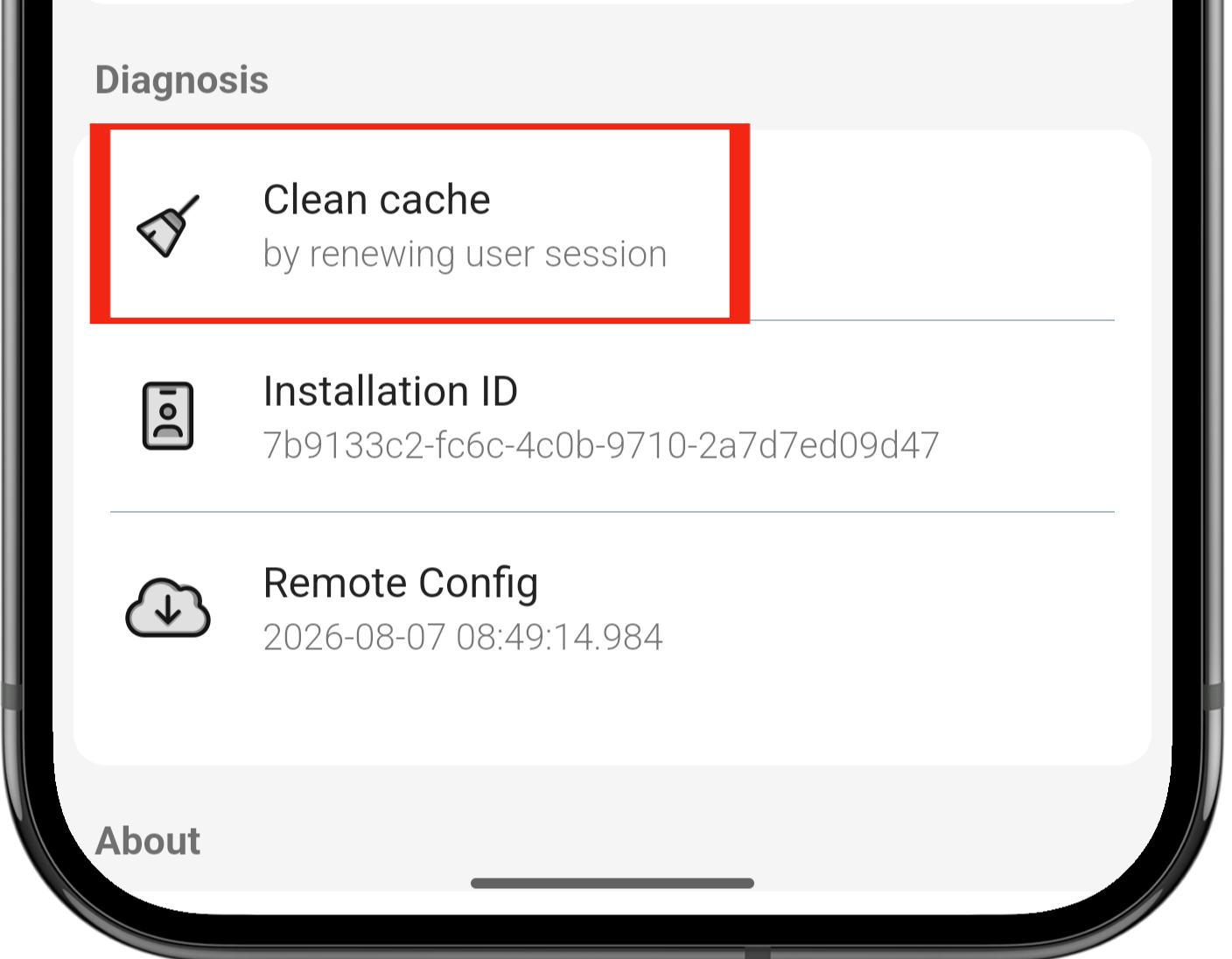
The cache may need to be refreshed for the application to work correctly, as in GLPI. The steps are the following:
- From the main screen, open the side menu.
- Tap the gear icon to open Settings.
- Find the Clean cache option.
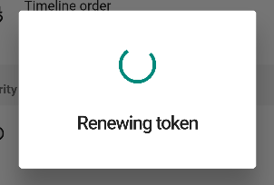
- The app asks to log in again; the process is complete.
Tickets
Create a Ticket
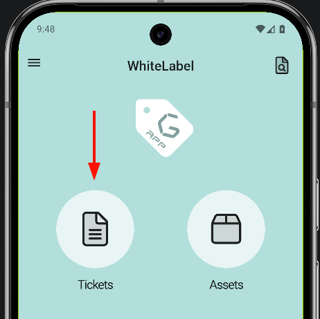
Go to ticket creation
First, go to the ticket section of the application. Once there, a floating action button appears in the bottom-right corner of the screen.
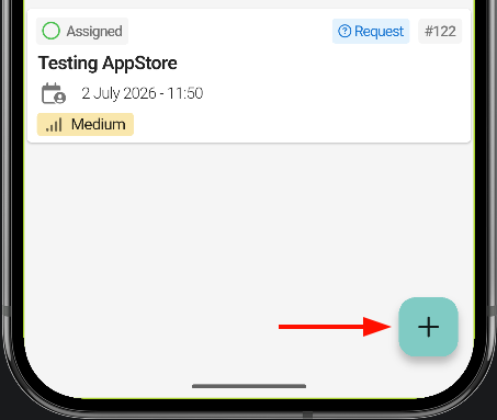
The ticket creation page opens. First, select the ticket type: Request or Incident. The numbered list below explains what each element on the screen does.
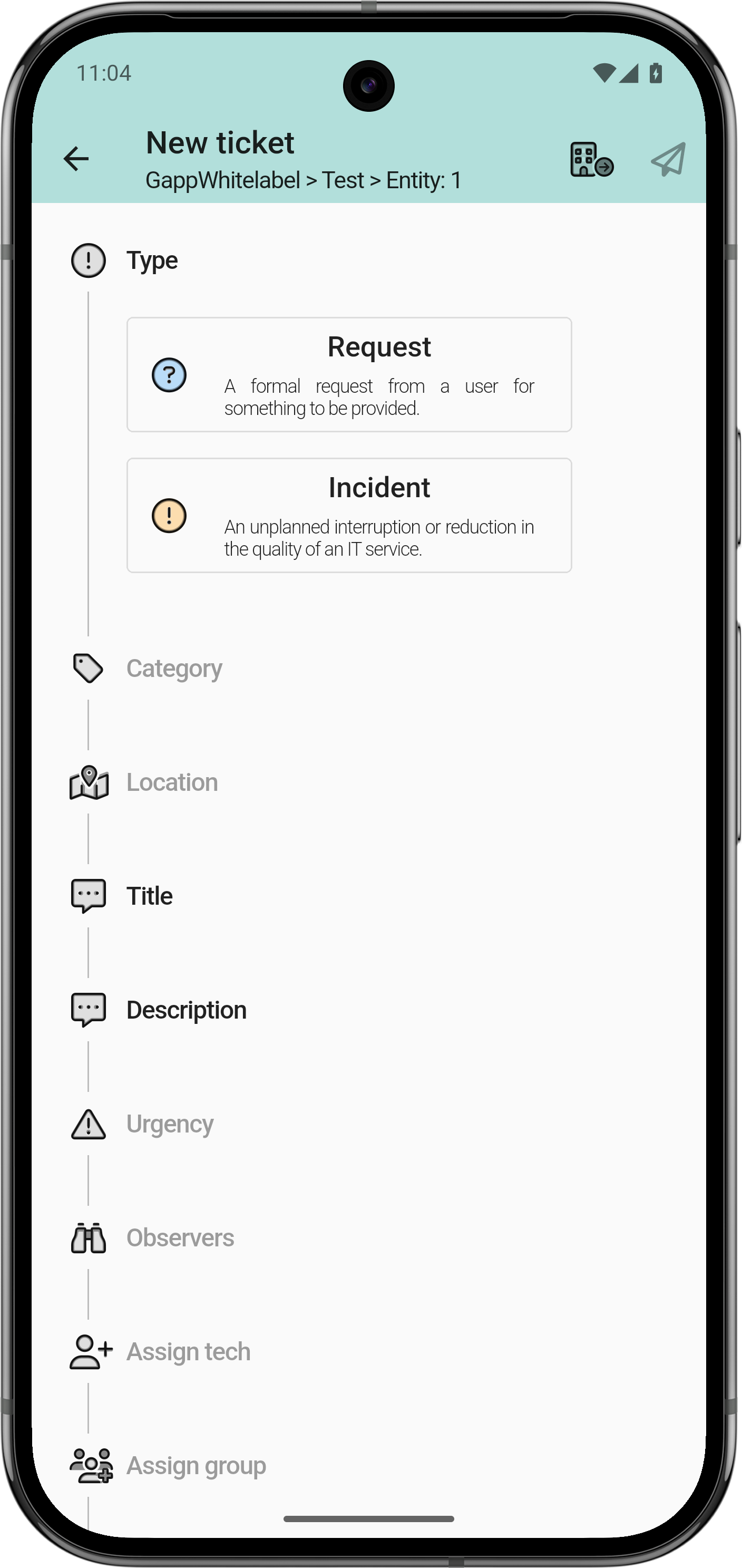
The plugin options Xtended in GLPI define which fields are optional and which are required.
- Required: bold.
- Optional: light grey.
The fields that can be marked as required are: category, location, urgency and observers

Select the correct entity
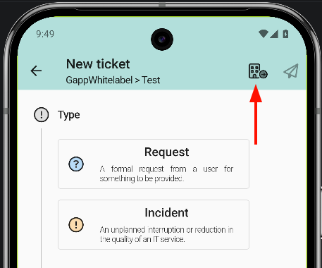
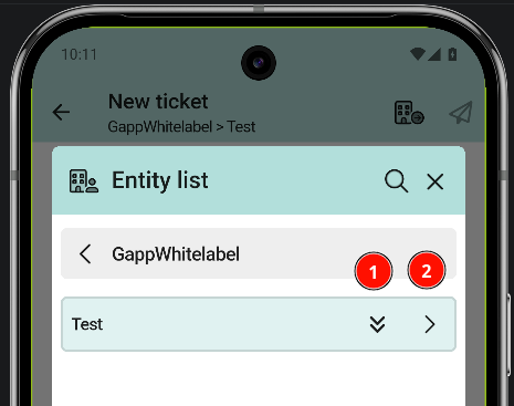
To select the correct entity, tap the building icon in the top bar; a list opens with all the entities available for the profile.
An entity can contain sub-entities; tap the right arrow to move between them.
- Arrow pointing down: select the entity.
- Arrow pointing right: view sub-entities.
Change the ticket category
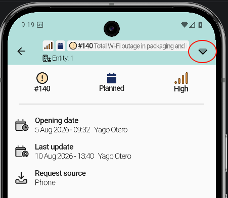
To change the category of a ticket, open the Request / Incident tab. An arrow in the top bar shows the category options.
- Open the ticket.
- Go to the Request / Incident tab.
- Tap the arrow in the top bar.
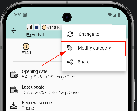
- Tap Modify category.
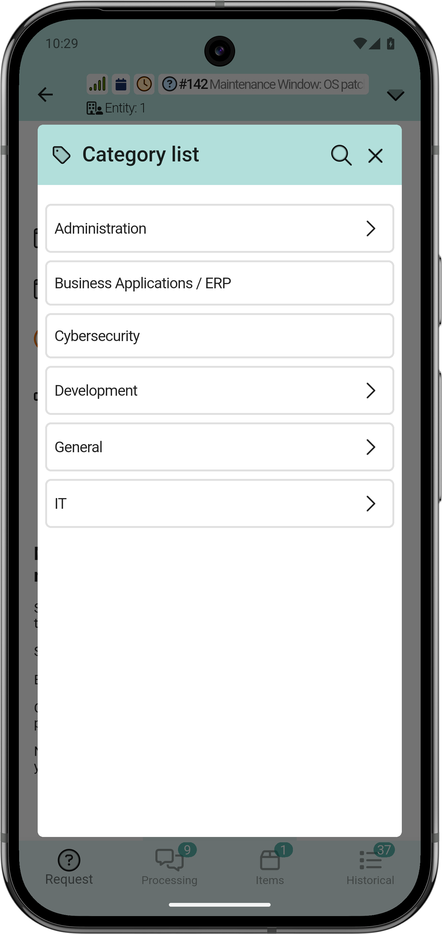
The list shows all the categories available for the profile or entity.
A category can contain subcategories.
Change Ticket Actors
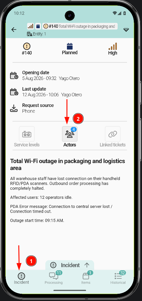
To change the actors of a ticket, open the Request / Incident tab, depending on the type of ticket. Tap Actors; a list opens with the different actor types.
- Open the ticket.
- Go to the Request / Incident tab.
- Tap Actors.
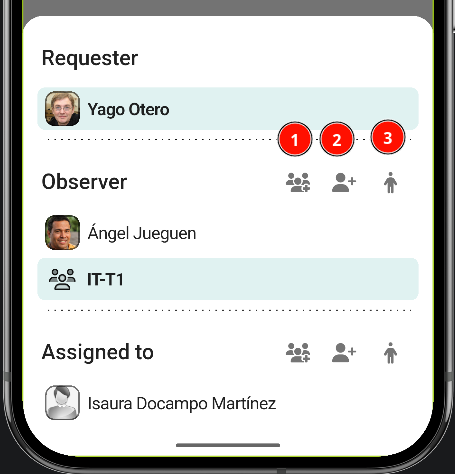
- Add groups: To add groups, tap the button with the three-person icon.
-
Add individual: This process is similar: tap the button and select the person from the list.
-
Self-assignment : To get involved directly as an observer or technician, tap the person icon; the assignment is applied automatically.
Remove people / groups
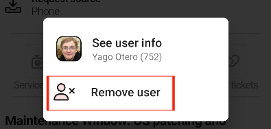
To remove people or groups, tap them and confirm the removal.
Create a Task
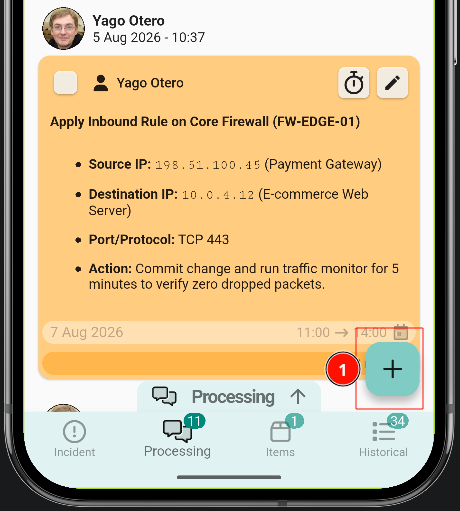
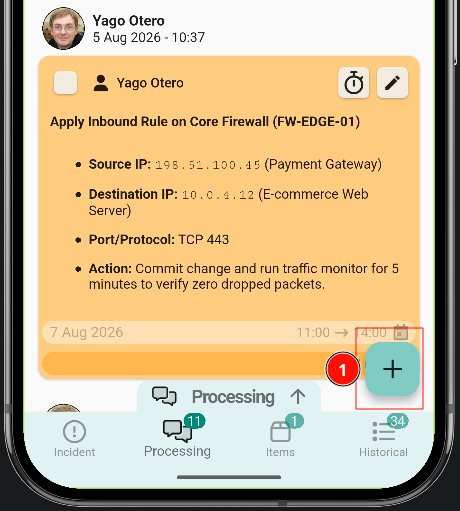
To create a task, open a ticket. A (+) button sits in the bottom-right corner of the screen; tapping it opens the ticket actions menu, where Add a new task creates a task.
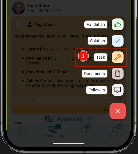
Create a task
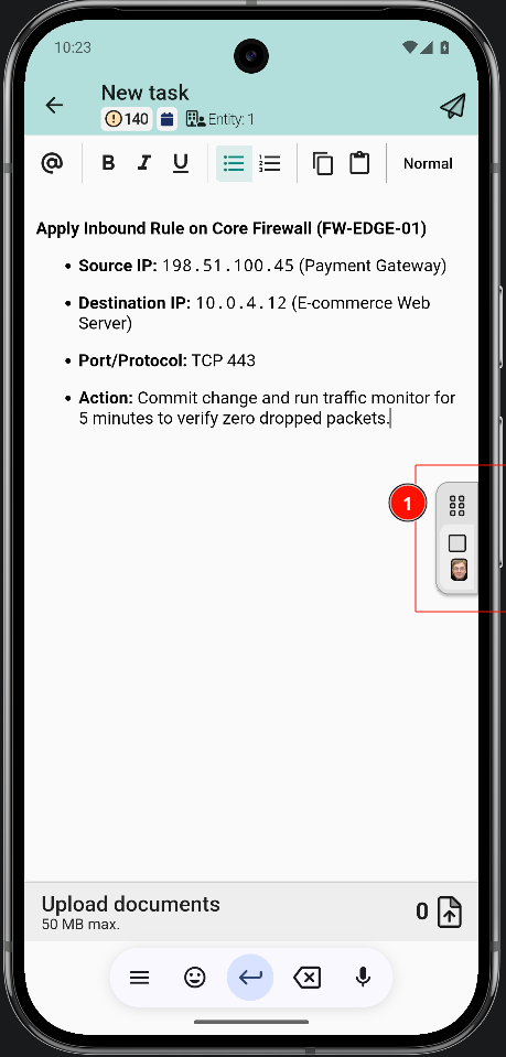
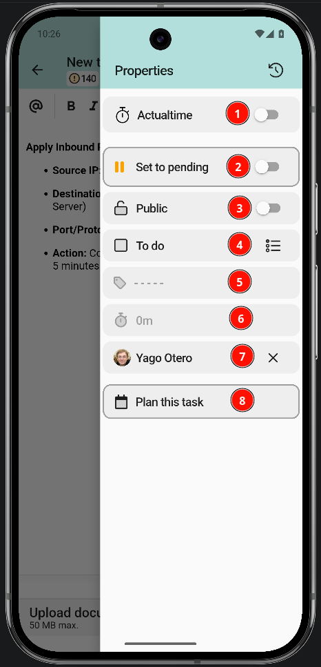
The task shares most of the follow-up structure, with additional status, category and planning options.
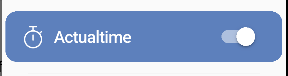
- ActualTime. It is covered in detail below.
- Put the task on hold.
- Public or private task. The client does not always need to see this information.
- Mark the task as done.
- Task category.
- Task duration.
- Assigned technician.
- Plan the task.
Work with an ActualTime
The first option of the menu is the timer: it counts the time from when the task is started until it is paused.
Notification permissions must be enabled on the device. ActualTime relies on them to track time in the background and to alert when a task is running.
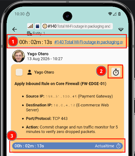
The ActualTime timer starts with this option. Once active, it looks like this:
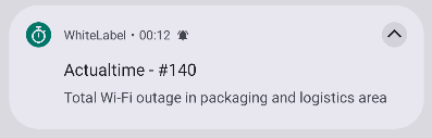
There are three ways to check how long the task has been running.
Tapping the running task from another screen moves the view to it automatically.
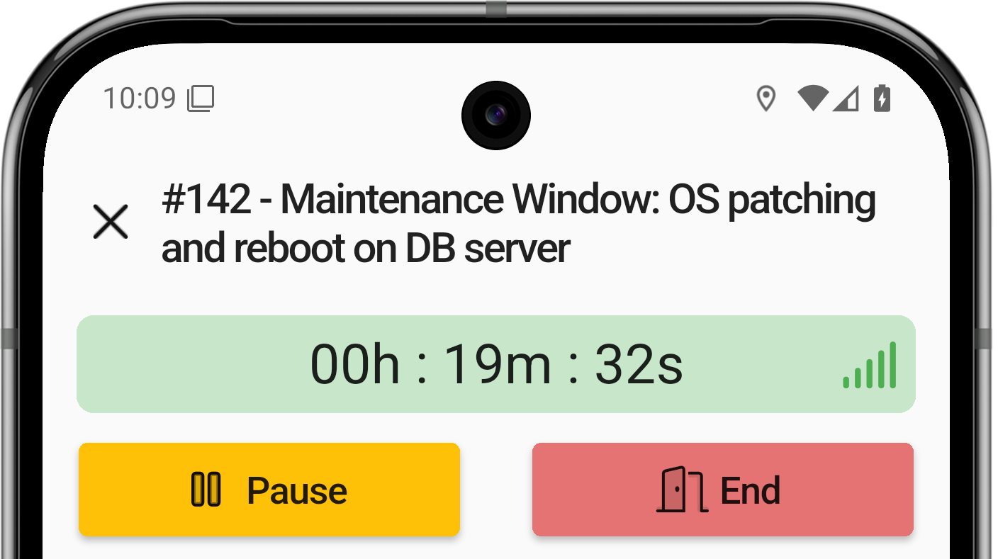
With the counter running, the task can be opened to pause it or mark it as done from the clock icon described in point 2 above.
The task can be started and paused as many times as needed.
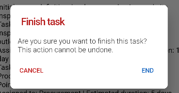
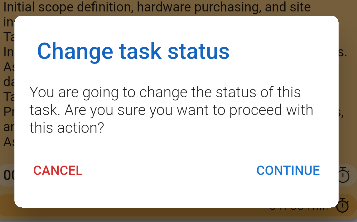
Finishing a task shows an alert asking for confirmation.
Change task status
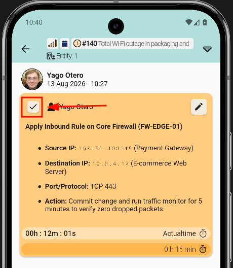
There is another way to mark the task as done: a checkbox in the top-left corner of the ticket view.
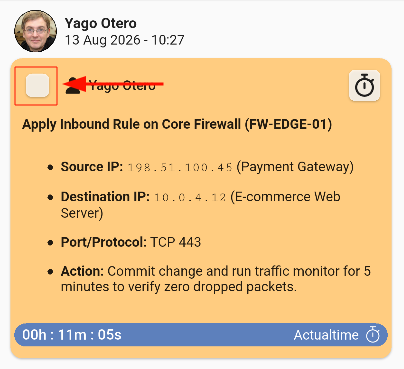
Tapping the checkbox asks for confirmation.
After confirming, an arrow shows whether the task is finished.
Edit task
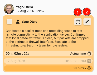
Tasks can always be edited again: even after a task has been sent, it can be reopened and modified. Two options are available:
- Clock: edit the ActualTime.
- Pencil: edit the task fields.
More ActualTime options
ActualTime has a wide range of customization options; these are the most important ones related to the app.


Plan a task
A task can be planned so that, later on, the technician in charge knows what they have to do and can do their job successfully. Users must select a day from the calendar to perform the task.
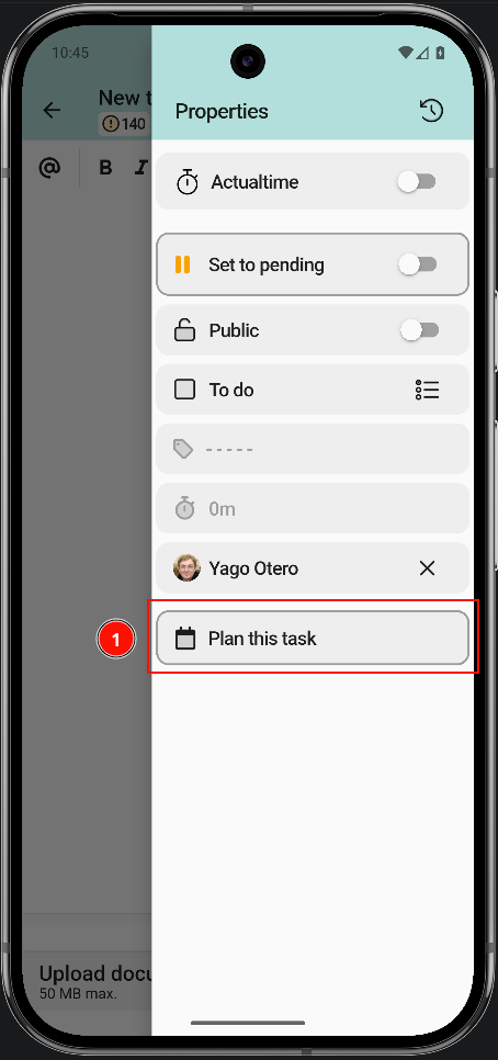
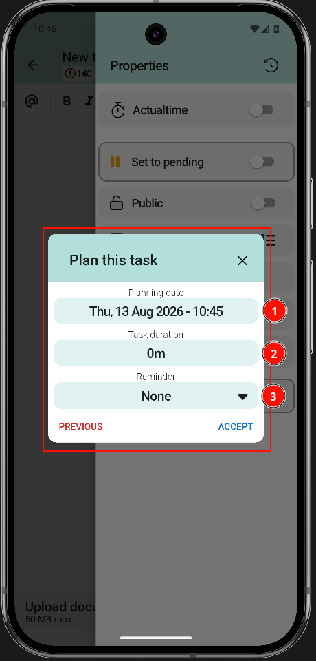
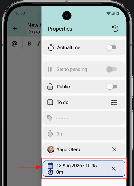
Once the planning is complete, the information is displayed as shown here:
Create a Followup
Follow-ups are created from inside a ticket, through the ticket actions menu. Each option is explained below, starting with the follow-up:
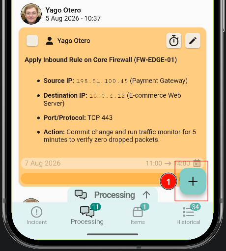
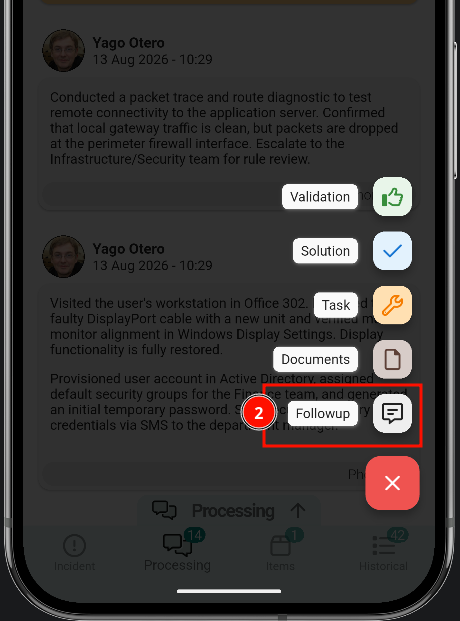
The creator opens a text editor where the follow-up is written in detail, with options such as numbered or bulleted lists, copy and paste.
Mention people
Colleagues can be mentioned with the @ symbol. The steps are the following:
- Tap the @ symbol.
- Search for the colleague in the list.
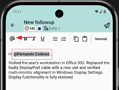
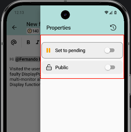
1.2 Additional options for the follow-up
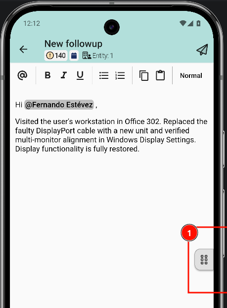
The follow-up can have two additional options: mark the ticket as on hold or as public. To mark these options, go to the hamburger menu on the right.
Create and modify Solutions
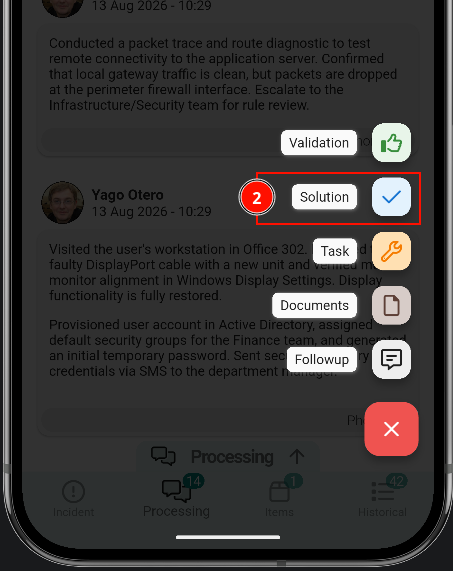
Solutions are created the same way as follow-ups or tasks: tap the button in the bottom-right corner, select Solution, write the reason and send it.
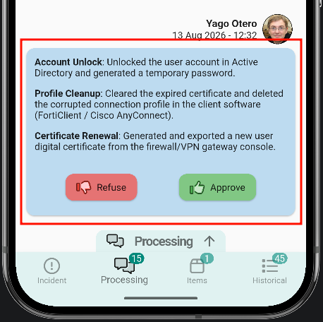
Once sent, the solution appears in the message list with two options: approve or reject.
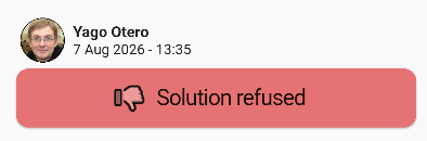
Reject the solution
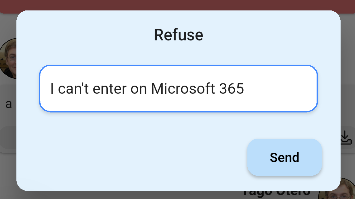
Rejecting the solution asks for a reason. The message list then shows it as rejected.
Approve the solution
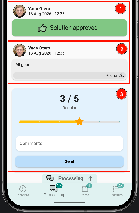
Approving a solution asks for a comment; once it is sent, the ticket is closed. The ticket may be closed, but a satisfaction survey remains open, where the solution can be rated from 1 to 5.
Once the solution is approved, no further updates can be written to the ticket.
- The approved solution is shown in the message list as approved.
View ticket history
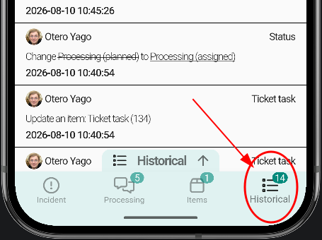
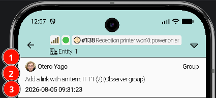
Open the ticket and switch to the Historical tab at the bottom. This tab logs every change made to the ticket: tasks, status updates, last modification dates, and more.
History entries
Each entry in the history shows four pieces of information:
- User who performed the action.
- Log describing what happened.
- Date when the change occurred.
- Log type categorising the entry.
Upload Documents
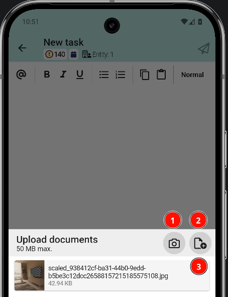
The application integrates with the smartphone's native functions: photos can be uploaded directly from the gallery or taken on the spot. Multiple files can be selected at once or one at a time. Once the first file is selected, the same screen remains open to select more files.
- Open camera.
- Local files or other sources.
- Files already selected.
Asset Handover
Read and assign assets to a user
How to read the assets a user has and assign new ones from the Asset Handover section.
1. Open Asset Handover
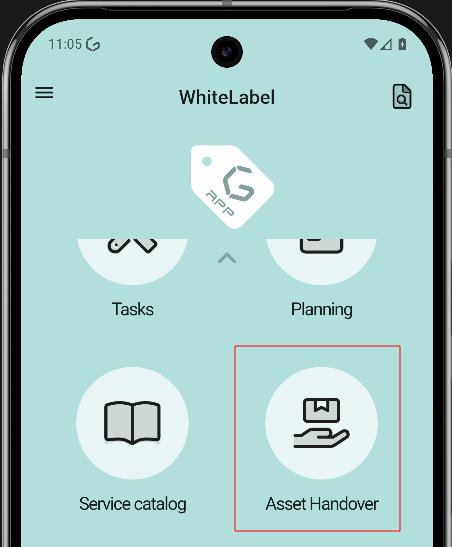
From the main screen, open the side menu and tap Asset Handover to enter the section.
2. Choose how to assign
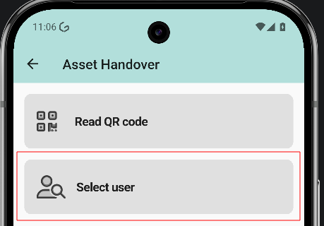
The screen offers two options: Read QR code and Select user. This guide covers the Select user flow.
3. Select the user
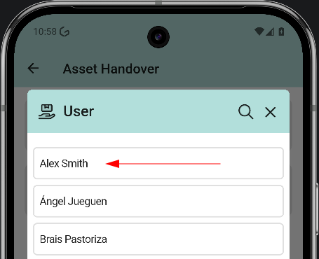
The user list opens. Tap the user who receives the asset. In the example, Alex Smith.
4. Read and assign from the user profile
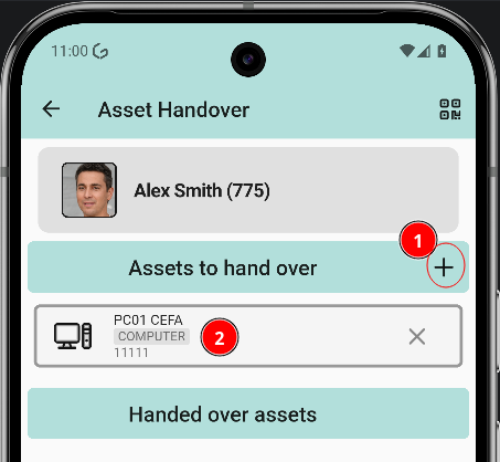
Tapping a user opens their profile, where the assets of that person can be read and new ones can be assigned. Two actions are available:
- Add new assets opens the asset list to assign a new asset.
- Asset list shows the assets the user already has.
5. Pick the asset
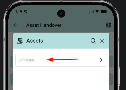
The asset list opens with the available assets. Tap the asset to assign.
6. Asset added
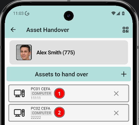
Back in the user profile, the asset list shows the previous asset and the newly assigned one.
Assign an item to a ticket
Items are assigned to a ticket from the GLPI web interface. Once linked, they appear in the Items tab of the ticket inside the app.
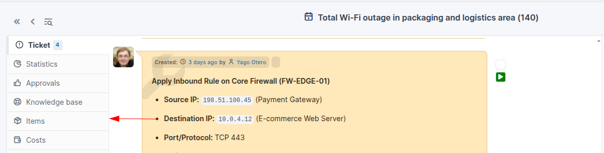
Link an item from GLPI
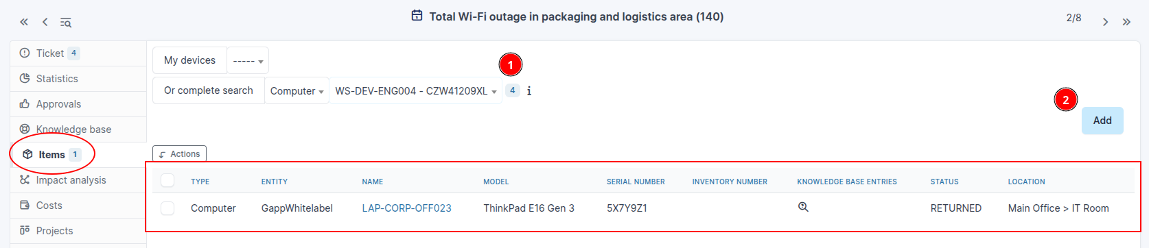
Open the ticket in the GLPI web interface and switch to the Items tab.
Select the item type and the device, then click Add.
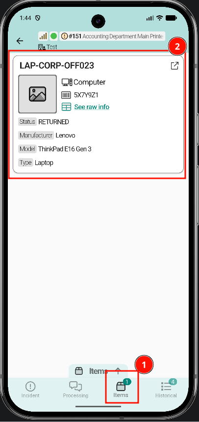
View items in the app
Once the item is linked, it shows up in the Items tab at the bottom of the ticket detail screen.
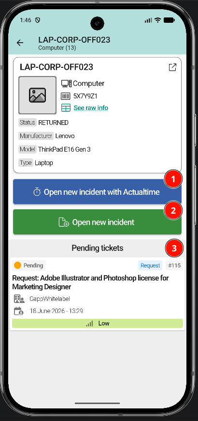
Tapping an item opens its full detail: raw information, linked tickets, and available quick actions.
Geolocation
New Page
